The standard US FDA nutrition label is well-known here in the states because it is both consistent (for better or worse) and ubiquitous: you’ll find it on almost all packaged foods, excluding certain foods like fresh meat (until 2012) and fresh baked goods (creating an opening in the market for cupcake detectives).
As we consider the equivalent of a nutritional label for information consumption, I’d like to strike a balance between the consistent, widely-recognized FDA label and the far more creative, dynamic approaches to visualizing information all over the internet.
Our MediaRDI project is underway, and we’ll have two classes of “newstritional” information to display (don’t worry, I won’t use that word again). Our first phase will be to display information about a given news provider, such as the New York Times or CNN. A news consumer such as yourself could see, at a glance, what sort of topics a source provides, and what you might be gaining or missing by reading it exclusively. This could also help professional journalists by visualizing what they’re covering and what they’re missing – they could even advertise their breadth of coverage or depth in a given topic.
Further down the road a bit, we might focus on visualizing the news consumption of actual individuals across their entire media diet. First, we’d have to track media consumption across web, podcasts, TV, newspaper, Twitter, and so on, and then we’d have to parse and visualize it. This phase might be most exciting to the most people, especially if we can make it easier and prettier to display aggregate information consumption.
Visualizing Media by News Provider
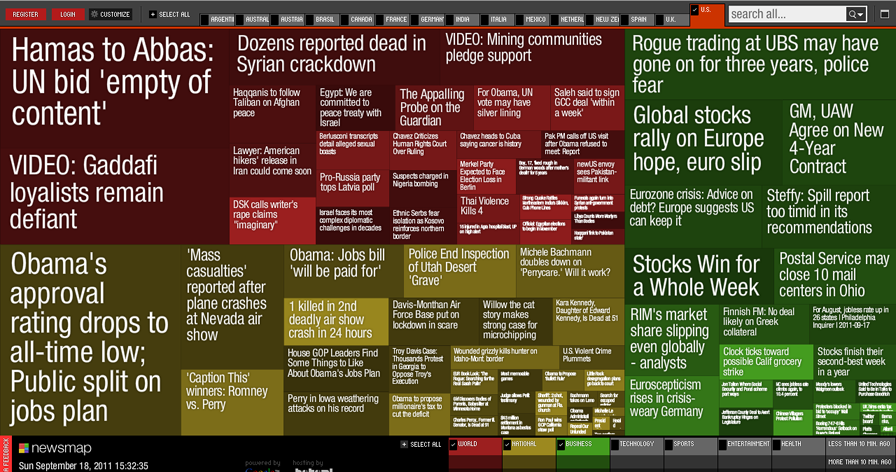
One example that immediately jumps to mind is an old favorite, the treemap visualization of Google News (Markos Weskamp went on to bring us Flipboard).
“Google News automatically groups news [s]tories with similar content and places them based on algorithmic results into clusters. In Newsmap, the size of each cell is determined by the amount of related articles that exist inside each news cluster that the Google News Aggregator presents. In that way users can quickly identify which news stories have been given the most coverage, viewing the map by region, topic or time. Through that process it still accentuates the importance of a given article.
“Newsmap also allows to compare the news landscape among several countries, making it possible to differentiate which countries give more coverage to, for example, more national news than international or sports rather than business.”
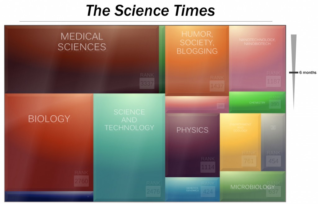
This approach is interesting for a couple of reasons. Treemaps are great at visualizing distributions of information in a constrained layout. They also happen to resemble the traditional newspaper column layouts we know and love. Here’s a mockup I did with LabGrab’s treemap of science news:
This visual format could be used to display the categories of news offered by a single source. The name of the news source could remain in the familiar masthead location. We could also add a dynamic slider on the right to allow the user to adjust the timeframe of news coverage represented in the treemap. A user could compare how this news provider’s coverage distributes over the last few years versus the last few weeks.
A great way to visualize the depth and breadth of topics in the news might be stream graphs, like this view of box office returns by the New York Times: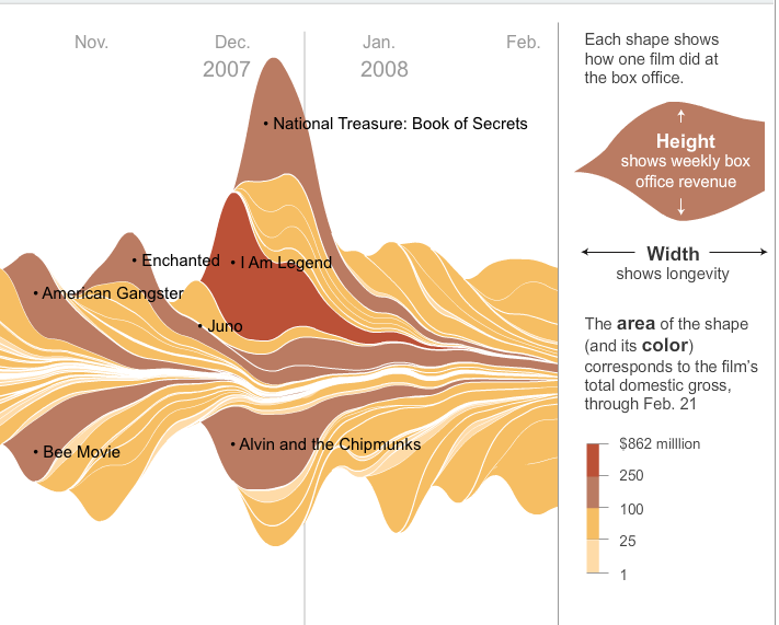
As Nathan says, they look sort of like latte art. Check out Lee Byron’s Streamgraph generator on GitHub.
I’m particularly interested in what happens when you restrict the area of a Streamgraph to something relative, like visualizing 100% of the news in a given paper, creating a Stacked Area Graph. This form allows you to see how one category of data affects another:
If we’re interested in displaying the geographic reach (or lack thereof) of a given news source, it’d be great to be able to show a heatmap of the world, with intensities representing news about those areas. We’re not necessarily able to accurately say which articles cover which geographic areas yet, but I’d enjoy this visual if I were looking to expand my international news consumption (just as the Where I’ve Been Facebook app set off a tidal wave of users visually charting where they’ve traveled and where they’d like to visit).

Heatmap image by igrigorik shared under Creative Commons Attribution-NonCommercial-ShareAlike license.
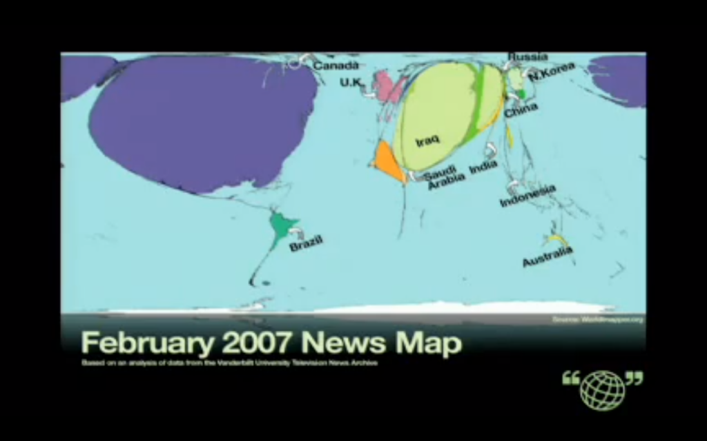
Another approach to the world map visualization is the telling visual Alisa Miller used in her TED Talk about our news diets:
It makes one think to actually see that, as far as our news diet goes, huge swaths of our planet and fellow humanity don’t even exist to us.
Visualizing News by Personal Consumption
Given that information consumption is an exercise of the mind, first and foremost, it might also be fun and useful to display a treemap in the form of a human brain. I imagine I’d be compelled to change my habits if I could see that a large chunk of my mental intake consisted of iPhone 5 rumors.
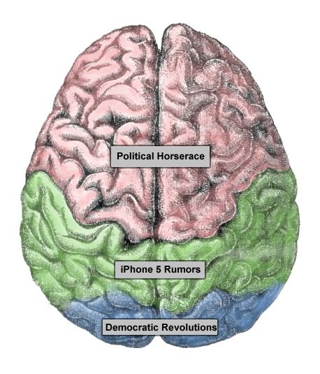
Original brain image shared under Creative Commons Attribution-ShareAlike license.
Of course, a pie chart is a simple and great way to display percentages of a whole. Maybe we put it in a stopwatch housing to gently remind the user that the data represents how they’re spending their time, for better or worse.
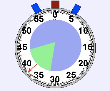
Original image created by lookang shared under Creative Commons Attribution-ShareAlike license.
One of the most useful personal information tools I use is Mint.com. Sure, they get every detail of my financial data, but I’m not convinced the banks didn’t have this anyway. At least with Mint I, too, get to see what my consumer profile looks like over time. Mint was wise enough to realize that financial information can be pretty boring if left to programs like Quickbooks, and has therefore prioritized visually attractive displays and interfaces. Perhaps that’s why Intuit bought Mint for $170 million.
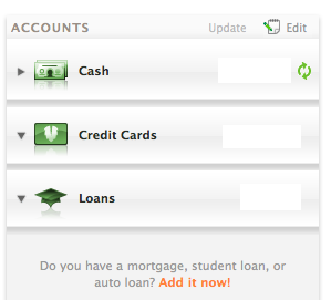 Mint helps individuals view their personal finances from a number of angles. First, you load all of your financial accounts, including checking, savings, loans, and credit cards. Having everything in one place allows Mint to aggregate every transaction, eliminate duplicates, and provide an at-a-glance overview of your complete financial record.
Replicating this for media consumption would likely require plugins and devices for the myriad ways we consume media, but wouldn’t be impossible. A browser extension and Twitter client could automatically log time spent with various news (like RescueTime), although certain media might require manual logging using a mobile app (like going to see a movie).
Mint also lets users set a monthly budget by spending category. This method could certainly be applied to media consumption. The budgeted categories of media and amount of time allotted to them are entirely up to the individual’s unique goals. Here’s a mockup of what this might look like:
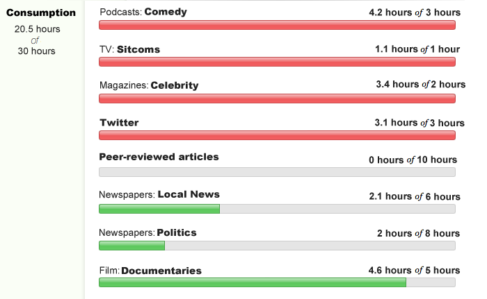
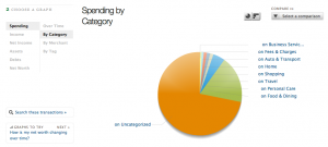
You can also see your spending, by category, on pie and bar charts:
Things get interesting as you dive into the compare-by-city and compare-by-state features:

Of course, not everyone has the time or inclination to dive in this deeply. For this reason, when you first log in, Mint serves up important alerts based on your activity:
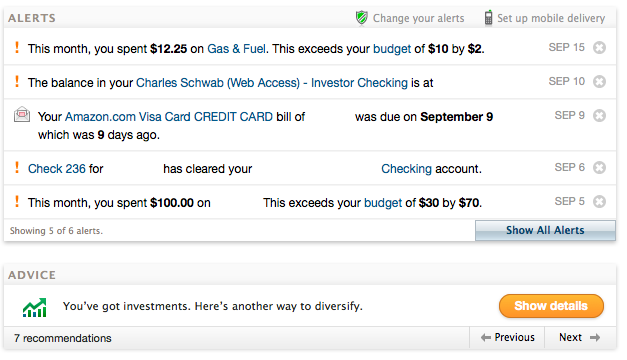
Mint also selects and offers additional financial products depending on your activity. While I don’t need another credit card, I might be interested in a subscription to The Economist if I’m trying to bulk up on my international news diet.

Lastly, as we’re considering personal metrics, we should also look at FitBit and Nike Plus and how they display fitness information. Both services are loved, not only because they track and display your personal metrics, but because they build in motivational tricks that exploit human psychology to encourage healthy habits.
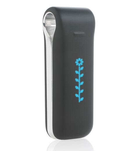 Like Mint, FitBit offers in-depth analytics for true data hounds, but also an at-a-glance display of your personal metrics. In practically every review I’ve read, the FitBit device is lauded for the little blue LED flower.
Sure, FitBit’s sensors capture all sorts of data that can later be uploaded to and analyzed with their web service, but the immediate payoff for wearing the thing is a Tamagotchi-style flower that thrives or withers based on how much you move or sit. I’d be willing to bet that concerns for the flower’s health motivate more people than the number on a chart of a web service.
Nike Plus’s primary motivational force is peer pressure. At first, the promotional video offers “an endless parade of information” about you and your runs, and the service does offer maps, metrics, and exercise plans. But sports are competitive, and Nike Plus rightly focuses on the social element. You can directly challenge (or cheer on) friends who also use Nike Plus, not to mention brag on Facebook and Twitter.
Do you have more ideas on how to best display the numbers behind our news? Let us know in the comments, if you would. The nice thing about the MediaRDI project is that this data will be open, so designers far more talented than myself could create visually compelling interfaces for exploring our personal information metrics.

