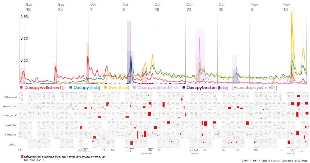
Surface dedicated in Newspapers front pages vs. Twitter about #Occupy Nov. 17th after Occupy Wall Street eviction.
This project began last May, during the first moments of the #SpanishRevolution. Since then, I’ve been making some experiments and improvements. Now that the term is coming to an end, I will go through the story of this process and try to envision future steps. I wanted to present this Newspapers’ Front Page analysis tool (still looking for a name) as my final project in the Intro to Civic Media course, that I’ve been auditing. Funny coincidence that on Monday we watched in class the documentary Page One: Inside the New York Times, with the debates at NYT about the selection of news for the front page.
It’s also good moment to announce that this Friday we are hosting a session of the #occupyData Hackathon about Twitter Occupy Tags in Media Lab. It will be a good moment to discuss the links between Twitter and Mainstream Media.
You can find more examples of this project at http://numeroteca.org/cat/frontpage-newspaper/
Abstract
Social media (SM) like Twitter and Facebook seem to be playing an important role in the current wave of social movements around the globe, from the so-called Arab Spring to the Occupy movement in the US. Social media have become also a key source of information for many people, as well as for Mainstream Media (MSM), whose strategies of communication have changed to incorporate this social component. The streams of information flow rapidly from SM to MSM and back again, MSM to SM, re-feeding the loop.
The project focuses its analysis in newspapers’ front pages as an concrete example of the MSM ecology. We will study the relationship between SM -with data from Twitter- and the coverage in newspapers regarding recent social movements: the Arab Spring (Tunisia, Egypt, Syria, Argelia), the 15-M Movement #SpanishRevolution (Spain) and the Occupy movement (USA). The data visualizations try to interpret the spread of news in contemporary society; moreover, they map the dialogic intersections of the ‘hidden and public’ transcripts.
[Abstract written for a panel discussion proposal for the ICA].
Story of the project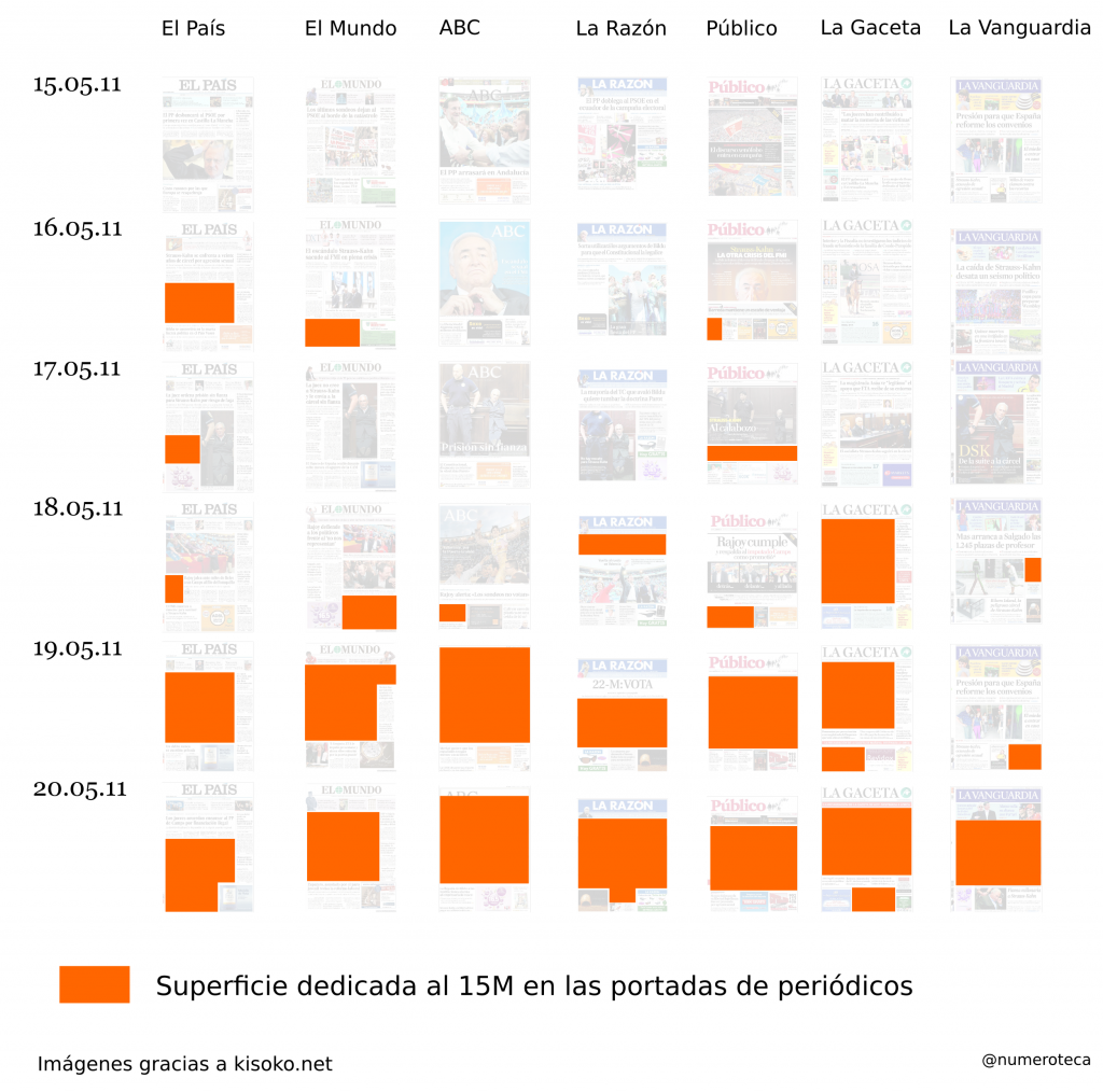
First sketch of the front page analysis. First days of #15M movement.
On Sunday May 15th, 2011, there was a grassroots organized march in many cities in Spain under the motto “Real Democracy Now” (Democracia Real Ya). These demonstrations were occurring one week before the municipal elections. Around 100,000 people throughout the country started what later was going to be called #15M, the #SpanishRevolution or the ‘indignados’ movement. It was inspired by the Arab Spring and the Icelandic Revolution, and was based in previous social movements in Spain (for example: against censorship in the Internet; for change in the electoral system #nolesvotes; rights to housing). We will not go deep into the origins or consequences of the 15M movement, it is enough to say that it was a march organized by people and not supported by any party or union. A decentralized organization based on the Internet that opted for a multi-site demonstration, instead of the traditional march in the capital (Madrid). No flags were used and the ‘ghosts’ of the two Spains, the two big parties nowadays, were absent. Despite its success, the Mainstream Media did not pay much attention to it.
That Sunday night after the march, around 40 people decided to stay in Puerta del Sol, the central square from Madrid. They wanted to keep on with the mobilization, and they managed to convince the police to let them stay in the square during the night. They organized their first General Assembly and started to make the first working groups. Next day, much more people came to show support, and around 300 had stayed on to sleep in the square for the second night. At 5am police evicted them, and act that was the tipping point of the movement. On Tuesday evening, to protest the eviction, more than 10,000 people were crowded into the Puerta del Sol. By then, because I witnessed all these events from Boston, I was absorbed with the #acampadasol hashtag, the 24h live streaming, and trying to follow every bit of information about what was happening in my hometown, Madrid.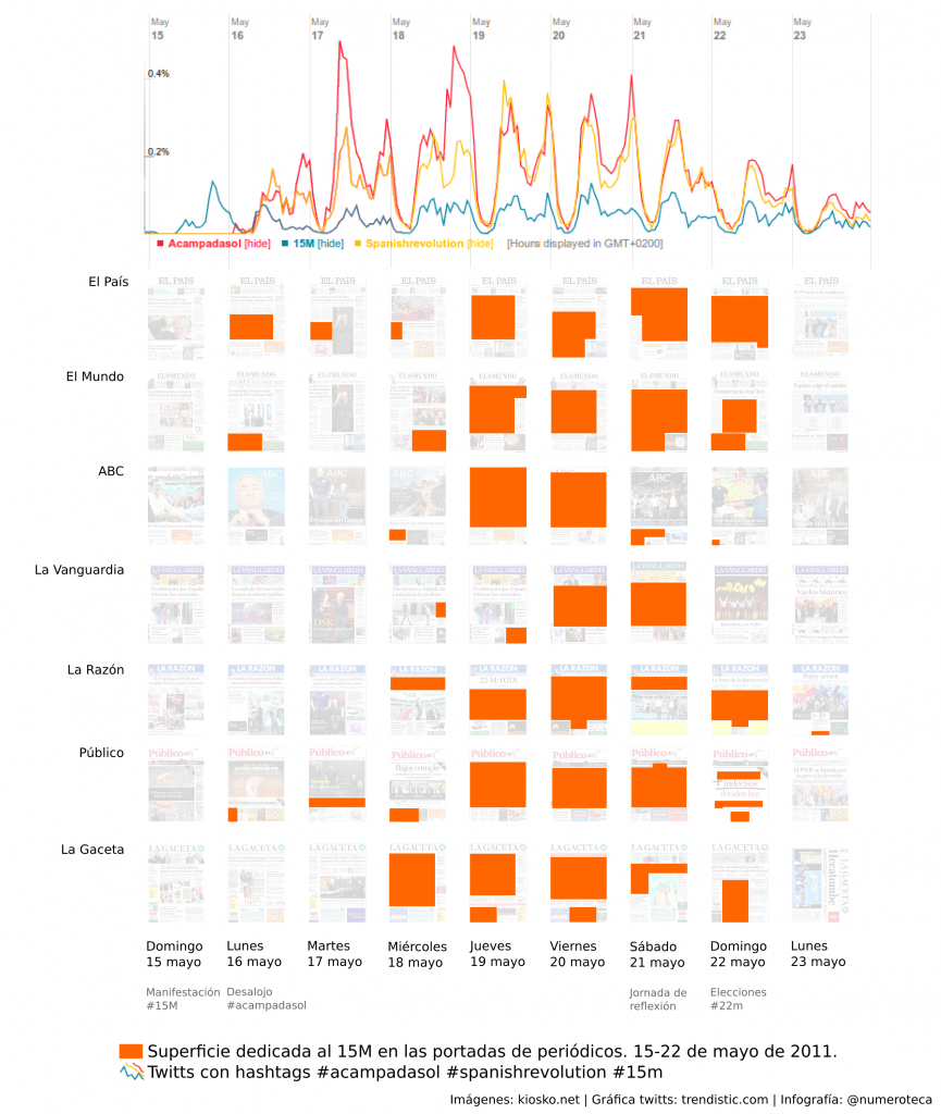
Spanish newspapers’ front pages and #15M coverage vs Twitter (data from Trendistic).
Some major newspapers were covering the events, but people in social media, mainly Facebook and Twitter, argued that they were not getting enough coverage in the Mainstream Media. One of those long nights I tried to answer the question: when the newspapers started fully covering about the #15M movement? and I twitted my first newspaper front page analysis. It showed that the protests started filling all the front pages only after the fourth night at Puerta del Sol, after the “tent cities” had already spread all around the country. The data visualization became popular after appearing in Meneame (the Spanish Digg), as it showed in a clear way the very moment when the protest entered the MSM. Indeed, it was used by many bloggers to demonstrate how the media had waited to much to cover the protests. On Wednesday May18th the electoral board in Madrid denied the right to march or gather in the square, and that made the protest even more successful than previous days. That was the moment when the protests became “news” for all the media: newspapers’ front pages and TV’s were filled with the story. International press covered it also, like the photo from Puerta del Sol square that appeared in The Washington Post’s front page, that echoed Tahrir square. The following Sunday, one week after the protest, the elections took place, but the camps and the spirit of change from the 15M movement remained.
‘Small multiple’ graphic
There are multiple ways in which this kind of graphic could be used and implemented. Here I list some examples of ways it could be used:
A. Compare simultaneous news evolution in time.
I made a first attempt with the detention of Strauss Kahn and the 15M movement. Then, as a research for the Instituto de Estudios sobre Conflictos y Acción humanitaria (IECAH) analyzed the arab spring coverage (Egypt, Syria an Lybia) in Spanish newspapers. How news collide and juxtapose?
Read interesting article, in Spanish, Estudio de la cobertura periodística sobre las revueltas árabes.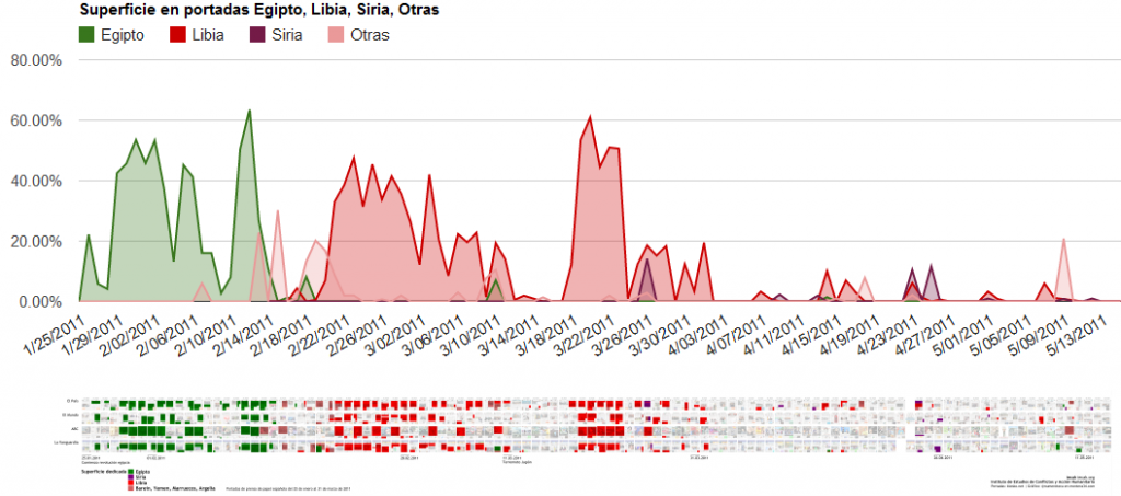
Arab spring coverage (Egypt, Syria and Lybia) in four Spanish newspapers. 2011
B. Compare asynchronous news evolution in time.
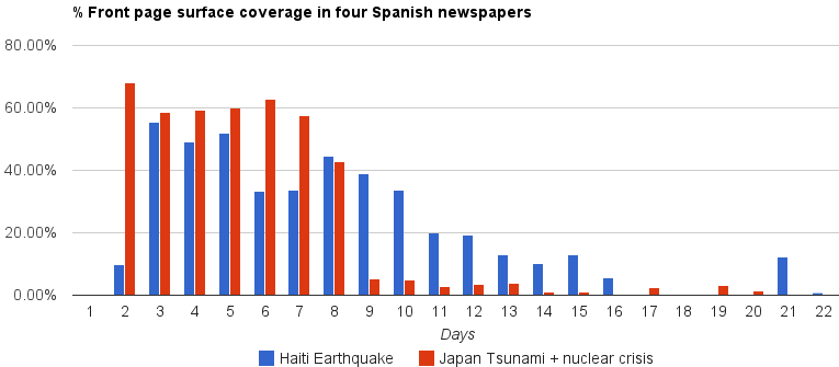
In the comparision of the surface dedicated to cover the Haiti earthquake (day 1 = 01.12.2010) vs Japanese Tsunami (day 1 = 03.11.2011) in Spanish newspapers we could measure and compare the length of the coverage day by day. It is remarkable the rapid drop down from the Japanese crisis coverage after day 8th (03.18.2011), caused by the UNO’s authorization to the international community to enter the war in Lybia.
C. Semantic analysis of news content in front pages.
The fall of Mubarak and the fall of Ben Ali in Spanish newspapers regarding:
- revolt vs revolution
- dictatorial vs democratic
D. Content analysis
Using different colors to use the graphic visualization.
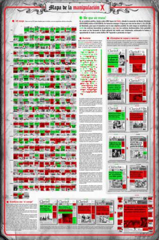
I found an interesting example of front page analysis about the Argentinian newspaper Clarin that showed how they changed from positive (red) to negative (red) news about the government in their headlines during 8 years. I am planning to apply a similar code to the news about the Occupy movement.
Analysis by positive and negative news. By Alejandro via zavekainfografica
E. Compare with TV broadcast transcripts.
Resources:
CNN http://edition.cnn.com/TRANSCRIPTS/
Voxalead: http://voxaleadnews.labs.exalead.com (not yet explored).
Broadcasts at archive.org.
F. Compare with social media, such as Twitter.
Comparing the popular hashtags #acampadasol, #15M, #spanishrevolution with the front pages, which arises another question about which specific words to follow. I’ve made a similar data analysis with the Occupy movement in US newspapers comparing it twitter.
Surface in Newspapers front pages vs. Twitter about #ows #Occupy Nov 30th 2011. I used tweets/dat data from r-shief, I am considering using tweets/hour to give a better idea of the picks (usually evictions).
Future steps
There are some questions and points that I would like to answer or take in account for the following steps:
- How to measure how accurate are newspapers’ front pages to show what the Mainstream media are talking about?
It would be great to compare results with the data from the Media RDI or Media Cloud projects. See for example what is the relationship between % in the front page’s surface with the length of the article (number of words). - Is the surface the only parameter to take in account? What about number of words, continuation of the article in the newspaper, position, image, size of headline? (I found a 2002, pdf: How to guide for news paper analysis, anything more updated?).
- Could these data visualization be a shortcut to help us interpret the spread of news?
- Provide a tool for creating the array of front pages. It is under development in Processing. It’s a script that downloads the front pages (now from kiosko.net) and generates a .svg file with the images in the array. Then you can highlight the news, measure the areas and produce the graphics.
Once the generation of the array is automatized, another path or next step would be to crowdsource the highlighting of news process and the measurement. Mechanical turk? suggestions for a framework?
- Front pages are a very specific space of newspapers. In Spain, the newspapers with the highest circulations have the shape and format from “dailys”. Spanish are smaller and have from 5 to 7 news in their front pages. US newspapers analyzed have from 10 to 34 news. Because of that the project seems to work better with the Spanish newspaper.
I made a quick research and the average of news/front page are (data extracted from a 21 days period):- Spanish newspapers: El País: 7.5; El Mundo: 7.5; ABC: 4.5, La Vanguardia: 5.1, La Razón: 4.9; Público: 4.6.
- US newspapers: WSJ 34.8 (28.0 of them short-headlines), The Washington post 13.1, The New York times 15.5; The Boston Globe 17.7 (9.2 of them short-headlines); USA Today 13.0; Los Angeles Times 9.7.
The project is open to collaborators. Leave your feedback!

