With the growth of the 99 Percent movement and occupations all over the world, a large number of citizen journalists and activists have turned to real-time video casting services such as livestream, ustream, and justin.tv. Live streaming offers a compelling way to experience a protest on-the-ground as it’s happening – and it has even trickled up to more traditional media services. Time.com published the live feed from The Other 99 on its front page last night during a 2000+ person strong general assembly in Liberty Plaza, NY. And CBS published a live stream of Bloomberg’s morning address in which he explained the city’s motivations for evicting protesters.
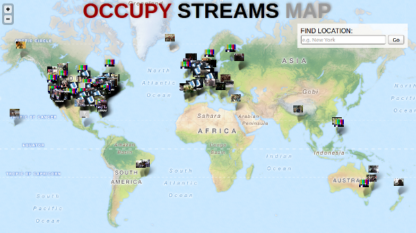
A few weeks ago, the website OccupyStreams.org sprang up to aggregate the huge number of streams from all over the world. Sasha suggested this would look good on a map. So I threw together a quick script which scrapes the Occupy Streams website, and geocodes the locations of the streams; after which it is easy to throw together a map:

The map uses open web technologies: the Leaflet web maps library (a light-weight open source alternative to Google Maps), and map data from Open Street Map (which crowd-sources map data from all over the world). The search function in the map uses Cloud Made‘s geocoding service, which is based on Open Street Map data. The result is a simple and useful visualization of the collection of streams that Occupy Streams did the hard work to curate.
I’m not always a fan of “pins-on-a-map” style visualizations – they tend to offer a rather simplistic and over-used way of visualizing data. Geographic maps are highly constraining as a visualization, because anything you do must conform to the expected spatial relationships between things on the map to remain understandable. But one thing this type of visualization shows very well is a sense of scale and breadth. We can see right away that the vast majority of the livestreams are from wealthier countries in North America and Europe, with much less representation elsewhere. We can also see how much of a hub New York is to the live streaming, with a full 12 different streams, as compared to four in Boston and five in the San Francisco Bay area.
The code to this visualization is freely available on GitHub, and I welcome any contributions, forks, or suggestions.