
From the OpenVisConf website: Jeffrey Heer is an Associate Professor of Computer Science & Engineering at the University of Washington, where he directs the Interactive Data Lab and conducts research on data visualization, human-computer interaction and social computing. The visualization tools developed by his lab (D3.js, Vega, Protovis, Prefuse) are used by researchers, companies and thousands of data enthusiasts around the world. His group’s research papers have received awards at the premier venues in Human-Computer Interaction and Information Visualization (ACM CHI, ACM UIST, IEEE InfoVis, IEEE VAST, EuroVis). Other awards include MIT Technology Review’s TR35 (2009), a Sloan Foundation Research Fellowship (2012), and a Moore Foundation Data-Driven Discovery Investigator award (2014). Jeff holds BS, MS and PhD degrees in Computer Science from UC Berkeley (whom he then betrayed to go teach at Stanford from 2009 to 2013). Jeff is also a co-founder of Trifacta, a provider of interactive tools for scalable data transformation.
He decided to talk about his work visualizing Big Data for today’s talk. How do you sample data? We have to think about to encode these visualizations but also how you encode them. But there was someone else talking about that!
Something else they do is leverage graphics hardware to do really high frame rates. But Nicolas and Domenikus are doing that.
Perhaps perception? We do that in our lab. Comparing the relative effective ness of decoding visual types. Color spaces – how do people name colors? How does that inform color palettes? This is fascinating and you’ll be hearing about that from Lane.
He decided to talk about Visualization Tools. His group has been responsible for things called Prefuse, Protovis, Vega and D3. He wants to talk about “Raising the Bar” to better represent visualization and enable better end-user tools.
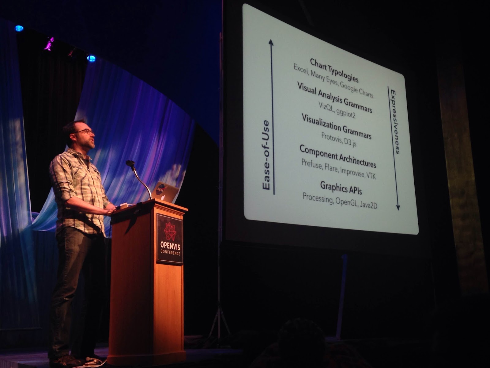
“How might we create visualizations?” is one of the main organizing questions. Typically you start with Excel and spreadsheets. This is good but there are limits to what you can do. Another common way is with code – like ggplot package in R. With small amoutns of code you can build rich graphics. For others it might be with d3 – a high level of expressivity but high bar to learn. He shows a chart that describes these hierarchies:
What is a Declarative Language? It describes WHAT you want not HOW to get there. Separates specificaation from execution. It is in contrast to imperative programming where you must give explicit steps. Declarative languages like HTML and CSS have been very powerful in other domains. SQL in the world of databases – you specify what you want from the data.
Why is he interested in these in the first place?
-
Faster iteration, less code, larger user base
-
Better visualizations – smarter defaults that raise the bar for all
-
Reuse – write once and then reapply
-
Performance – Opportunities for optimization and scalability and end user doesn’t have to worry about it
-
Portability – Multiple devices, renderers, inputs
-
Programmatic generation
We can aspire to more things that just charting tools. How do these languages enable that? He uses the example of Tableau. Are there other more powerful tools to explore once we have the right tool stack in place?
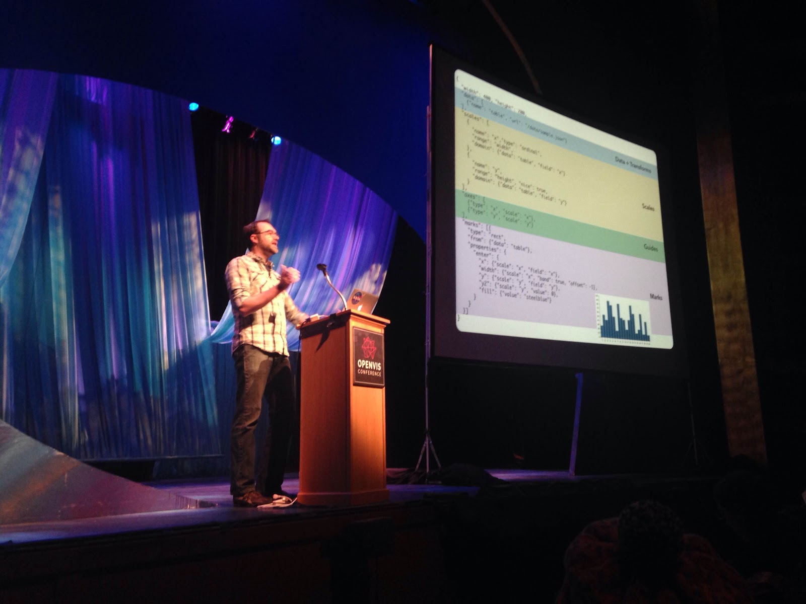
The basic backbone of web viz are Javascript, SVG and Canvas. Then d3 on top of that. Then Vega sits on top of that and leverages D3. It uses Visualization Grammar.
-
Data – what data do you want to visualize?
-
Transforms – grouping, stats, projection
-
Scales – Map data values to visual values
-
Guides – Axes and legends visualize scales
-
Marks – Data representation graphics; graphical primitives
These are the building blocks in Vega to create a wide variety of visualizations. He shows an example of the syntax of that in Vega:
Vega is open source. Supports many types of graphics. From this we have a foundation to build tools like Lyra – visualization design environment. It’s the analogue of Adobe Illustrator for visualization design. Without code. Now they are working on VegaLite – a formal model for statistical graphs. This uses short JSON syntax to create graphics that compile to Vega. Add parameters to customize. Another new tool is called Polestar – meant to be like Tableau. It’s a drag and drop environment but you also have access to the underlying Vega specification and you can access the code. You can also export this to a graphics program to improve and tweak it.
They are collaborating with folks at Tableau for some of this work. BUt all this work so far you have to specify the chart. What if you don’t know what you want? The Voyager tool suppoers ealy stage data exploration. They approach is to browse a gallery of visualizations. The challenge is that there are so many possibilities. It’s basically a recommendation system for visualizations that the user can then steer to their interests.
[Blogger’s Note: This is pretty cool.]
You can bookmark different things that it suggests. You can see from scatterplots to small multiples to log transformations. The goal is to accelerate the early stage of data exploration and understanding. Then you can export to Polestar and Lyra. The ecommendation engine behind the scenes is called Compass. Underlying everything is Lyra code that can be tweaked and customized.
They ran a user study to see if this works. It definitely improves data set coverage – different projections of that data set and manipulate more data they are able to encourage broader exploration.
The idea with these tools is that you can work with them as an ecosystem. One tool should not rule them all but our tools should work together.
But he wants to share one last thing…
What about interaction? His students have been building out interaction models for Vega. For example, “brushing” which enables more complex mouseovers and hovers in Vega graphics. Treat user input as “1st class streaming data”. They use techniques from “functional reactive programming” – these make concise and usable definitions of interactivity. They are calling this Vega 2.0 – “Reactive Vega”. He shows some examples – DimVis – allows interactive example for scrolling dimensions of visualization over two dimensions and then through time.
Their open challenges include:
-
Designing interactions interactively – how to convey and depict interactions?
-
Enhanding the “gallery” experience – Rapid assessment of multiple graphics? Embedding large views in small spaces?
-
Improving visualization recommenders – Learning from users; domain adaptation. People working in different domains might have different needs.
-
Debugging! As you abstract you end up procuding the need for new kinds of debugging. Can you visualize the visualization specification itself for the process of debugging?
All of this is open source on vega.github.io.
Questions:
Kern Keleher from Alpine Data Labs. Great to use this for foundation for large scale collaboration tool like Wikipedia. Could there be mass collaboration for data visualization?
Heer: Great topic for an incoming student. Hadley Wick, for example is using Vega under the hood. Folks from the Wikimedia Foundation are using it. We are already seeing that it’s supporting that kind of collaborative use. Great area for further research.
Nick: Interested in idea of statistical fishing with Voyager. Is there danger of visualization fishing? I.e. system suggests things that are only correlations and not real things.
Heer: Yes – does it violate statistical best practices? Short answer is that people already do this regularly on their own. Longer answer is that it’s about how you design the recommender system. They have taken a principled approach. First they show all univariate summaries. Some of the problems are “premature fixation” – where students decide that they know what’s going and then ignore the rest of their exploration that might have more interesting things. You can imagine more complex techniques that are searching ahead, for example. Those could have value but they start to go even deeper into the waters you are describing.
Audience member: On the trip from Lyra to SVG you go through D3 – are there any attempts of making D3 code comprehensible? Just give us the D3 program.
Heer: It’s possible. Originally I wanted to do a Vega to D3 compiler. When we start doing D3 code, it’s a lot of Vega and a little D3. It’s a fun open challenge if someone wanted to write a SVG to D3 compiler.
Audience member: In the process of exploring data you might transform and aggregate it, could you just get that data and pass it to the other tool?
Heer: Yes, we would just need to add a link. At the moment we do all the data processing client side. One student is looking at taking the data and sticking it into a database. Should buy you a lot more scalability.
Audience member: How does this handle sparse or irregular data?
Heer: Sparse shows up as missing values. Irregular data such as nested structures – you define access paths. Before that you can do like D3 and apply transforms. The data has to be there, though.
Audience member: About the front-end and back-end processing – what’s your vision for integrating with other tools like databases that do views?
Heer: To leverage what various databases provide. We don’t want to reinvent the wheel. But there are new challenges that come up. All sorts of interesting things about prefetching to make system more efficient.
Same audience: Would you control the pipeline?
Heer: If i knew the answer it wouldn’t be research.
Robert: Talking about scales from low level to high level. Do you have thoughts about the sweet spot for specificity?
Heer: The sweet spot is dependent on your task.