
Yesterday MassINC, along with a number of partners, hosted the event “Big Data and the Future of Journalism”. Here’s an excerpt from the event announcement:
“From 2008 to 2012, Nate Silver popularized a new category of media content, with readable and entertaining applications of data analysis to news stories and political events. His elections forecasting and poll aggregation has turned punditry on its head and proven that in numerous instances, math can tell us things that traditional reporting cannot. More and more young talent has emerged to expand the concept, with writers appearing on the staff of major publications and on blogs across the internet. Now, major media outlets including the New York Times and ESPN are making big moves into the space, hiring entire teams of top shelf “datarati” talent to expand popularized data analysis beyond politics and into other content verticals. What will the new entities look like? Beyond rumors, speculation, and a few blog posts, nobody knows for sure.”
This is a live blog of the proceedings of the panel.
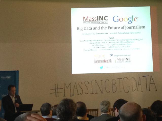
Steve Koczela (MassINC Polling Group) introduces the moderator and panelists: Not all Big Data is Big. There are many ways to visualize smaller data sets and bring data to the masses – things like ManyEyes, Tableau, et al. Some of the visualizations he shows are made with expensive one-off tools and some are made with the open source tools. Who stitches it together? Who mines the mountain of data? So far, it’s hobbyists, journalists, academics, and bloggers. Even academics are crowding onto the field. Is there an audience for news focused on data? He hopes panel will address the local mediascape and how it will change in relation to data reporting. Steve introduces Dan Kennedy from Northeastern University.
Dan discusses a number of examples of data driven journalism and states that today we have a power of information at the fingertips of journalists that we have never had before. Dan introduces the other panelists:
Laura Amico – Found and Editor of HomicideWatch. She has previously has been a Nieman and Knight fellow. She and her husband Chris Amico teach a class at Northeastern and run the Learning Lab for WBUR.
Paul McMorrow – Associate Editor at CommonWealth Magazine. Previously contributing editor at Boston Magazine. He got his start at the Weekly Dig where he worked as a staff writer. A lot of us know him best for his column on real estate and development on the Globe’s Op-Ed page.
John Bracken – Director of Media Innovation for the Knight Foundation. More than 10 years of experience investing in digital media and internet freedom.
Charles Kravitz – General Manager of WBUR which is widely regarded as one of the leading NPR stations in the US. He previously oversaw NECN, the largest cable news channel in America.
Laura begins the conversation. She says the data she is most familiar with the homicide data from where Homicide Watch sites are active: D.C., Trenton, Chicago. She says her data is not big data but still very interesting. The first questions she asks of data are “Who is this for?”, “What is it telling us?”, “What is it helping us understand?”, “What are the questions that prompted its collection?”
Laura: The best data projects start with really good questions. As a journalist, I know how to ask questions. Community members know how to ask questions of their communities. We know how we want politics, schools and communities to work. It’s about building an editorial framework to answer these questions.
Paul says it breaks down to two buckets. Paul: The first is using data to do traditional enterprise reporting. Using public documents to spin out stories. But now data sets are so big and technology has lowered the barriers to entry so that you don’t need to write code. In half hour I can download census results from an election, map it and publish it. All in my browser. It’s cheap and easy which makes it useful. The second bucket has to do with Nate Silver and the power of prediction. People want to get through the horserace aspect of the election and cut through the spin and get to the facts. The ability to do that is powerful.
John: Along with the other challenges we face in journalism are the cultural aspects. He asks how many people have an advanced degree in technology, math or statistics. Three people raise their hand. There are two sides of the coin – trying to create a workplace culture that is attractive to people with rare skills like engineers. On the other hand there is also a tendency in the social science fields to look at folks with hard skills as magical unicorns who can hop through the office and fix everything. That’s one thing to be conscious of. The other thing I want to circle on is talent. Because Nate Silver is also a damn good writer. For me, I think about baseball. The Phillies were the last to add a fulltime data analyst to their staff. A long time insider said “Tradition can be wonderful but it can also be an innovation killer.”
Dan Kennedy: Charlie, you had the insight to bring in Laura and Chris Amico to do journalism for WBUR. How is data changing what WBUR does on the radio and on the web?
Charlie Kravitz: It says something about the power of data visualization that a radio-centric organization is involved in it. I frankly don’t know where the role of data journalism is in radio journalism. It is inextricably connected now to data visualization. Our friends at WNYC in New York have gone nuts about this stuff. There was a time last year when the city announced it was going to close 23 fire stations. John Keefe, the News Director, had an idea to map the closing of the stations with census demographics and voting demographics to see if there was a political component. It turned out to be an interesting and controversial map that went all over the place. The fire stations still did close. This is an example they’ve used in NYC frequently – they tried to evaluate political motivations to evaluate whose streets were plowed in the snowstorms and whose were not. This is very interesting use of data. I’m not sure it’s “Big Data”. But I throw this out as an example because WBUR is dipping its toes into this. WNYC has a small team doing this. Even though there is technology that makes the number crunching more accessible, the question that I hope we delve into is – “At a time of existential crisis for journalism, is data visualization in some way a salvation? Is it something we can afford to do? Or is it always going to be a fringe? Or a fringe that will become mainstream?” I wouldn’t say that data journalism is mainstream still. When I think about paying the bills at WBUR, the question is “Is this the area I’m going to invest in?” I’m thrilled to have Laura and Chris at WBUR and want to give John Davidow credit for bringing them into the organization. They are paid for through a $100,000 grant from Knight and from the Boston Foundation. How can we sustain that? Data journalism is harnessing new tools for old journalism values of contextual journalism in a way that works well in the digital environment. All of us in journalism are struggling to figure out whether we invest in this sphere or not.
Dan: Is data journalism becoming central to what we do? Or will it be seen as something of a thrill for some time to come? What can we do if we can’t make it financially sustainable? That seems like a question for John.
John: I would be surprised if we were having Twitter discussions with the hashtag #dataviz five years from now. Knight just ran a NewsChallenge focused on Health and collecting personal data. I think it’s become deeper in what we are doing. I don’t know that we need a data journalism sustainability project as much as we just need a journalism sustainability project.
Dan: We’re talking about data journalism and “Big Data”. How do you distinguish regular data journalism from “Big Data”? What is a journalistic project that is truly making use of Big Data?
Paul: First I want to push back against Charlie. On the cost aspect – the stuff I use everyday is free. The census doesn’t cost anything. Google Maps doesn’t cost anything. These are 90% of the data work we do at the CommonWealth. What I’ve found is that when we dig in it makes our work better. It makes the reporting richer. It should just be part of how you cover your beat.
Charlie: Paul, journalists have been using maps and charts to visualize things in rudimentary terms for generations. The difference now is that it’s about being able to contextually combine different data sets that bring you insight you wouldn’t have otherwise. It’s more time consuming and expensive. As Laura and I were talking about earlier, you have to dig, dig, dig through the data to find the insights to bring things to the public.
Dan: Though Paul makes an interesting point. Previously you had to drive to the McCormick Building to look at campaign finance data. Some of the availability of data means that you save time and money.
Paul: Some of the difference is in the function it serves for reporting. Sometimes the visualization is the only thing people see.
Dan: Laura, can you talk about Big Data and your reaction to this conversation?
Laura: The journalism that I practice is called “Open Notebook Journalism”- this makes the promise that everything we have we are going to make available to you. You can access that data. It’s easy to get a lot of this information. What Open Notebook Journalism promises is that we open that data to you, too. It makes available the data to people who are smarter than the reporter. The community as a whole has a lot to contribute to that data set. There’s incredible value in making that happen and working on projects together. We haven’t yet talked about crowdsourced data. It raises a lot of interesting conversations about how do we as a community tell our stories through data. That’s where I think big data gets interesting and context comes into the conversation. I tend to shy away from conversations about the “Future of Journalism” that capitalize the ‘F’. I would urge newsroom managers to look at other things they are doing and see what’s not necessary and to see how they can help tell community stories with crowdsourced data.
John: I’ll mention two projects. Open Elections is a project which is all about collecting and making presentable information about election patterns throughout the country in the past. CensusReporter is a project out of Northwestern also focused on census data to make easier tools for journalists to engage with census data. Two other projects I’ll mention – the OpenStreet Map community creating tools that make it easier to contribute data. Here in Boston we’ve supported the Open Humans project to help people offer their personal data to medical research.
Laura discusses “What a Good School Is”, a Tumblr blog about Boston schools. Laura: We ask people to answer the question “What makes a good school?” Every person I’ve talked to had a different definition. As a whole their answers are much more interesting. Everyone here can go there and upload a new answer to that question. Over time we create an archive of what people’s expectations and hopes are for their schools. It’s not a numbers question but it is a community question.
Dan: I’m wondering if the rest of you can think of a way to quantify the kinds of answers people are posting to Tumblr and then use that to code different answers that fit in different categories. Where do you go next with that data? Could this lead to data or is it something that is unique the way it’s being done?
Charlie: I’m hoping that Laura and Chris together will find a lot of ways to plugin to this deeply confusing world of education and learning, particularly the funding of it. To follow the money and where it goes and tie that in contextually to opinions and crowdsourced views of what education should be. I guess that’s a blend of data journalism and crowdsourced journalism. Purely data driven journalism where you just throw a map up there is not going to be enough. For example, Planet Money is an interesting example which is doing blogs, podcasts, and multilayered looks at different issues. They used a lot of resources to track how a T shirt is made. It can come from a singular experiment like that or to broad crowdsourced information and data. Or coding individual opinions into categories. My sense is that it’s going to be a tapestry. One of the challenges we have in journalism is how much we are attracting the data crunchers to the field.
John: There are many data analysts and they might not necessarily be working on the Obama campaign or at the NSA.
Charlie: They are all at the NSA – that’s why we can’t find them.
Laura asks the panel to discuss where they are finding data now and where we might find data in the future.
Paul: What I try to do is visualize data in a couple different ways. To make a map. To play with it until you have that holy crap moment. It’s wrestling with these big piles. I dropped out of my college stats class after a week and a half. Visualization helps me put myself in the point of view of a reader. You are publishing for laypeople. It has to make sense to you and to them. The visualization end of it is a big part of it.
Dan: What skills do reporters need to bring to the table these days, especially young people. At Northeastern we have a combined major in Computer Science and Journalism but not many students are signing up for it.
Laura: Several years ago, when I had recently started Homicide Watch I was crunching numbers about a neighborhood, just doing simple addition, another journalist tweeted that I had a career in statistics if the journalism didn’t work out. I found that funny. I maintain that we need journalists that ask good questions.
Dan: Charlie, when you are hiring what are you looking for?
Charlie: Public Radio is renowned for its narrative journalism. We are looking for someone who is savvy but you have to be a great writer and storyteller. I don’t know whether there might be a built-in conflict between those skillsets and the great analytics and statistics skillsets. Right now WBUR is in the midst of thinking about that and whether its an investment we might want to make. Data may help us bring more context to our journalism. What kind of journalists do we need to make sense of that?
Dan: I sometimes hear it said that journalists don’t necessarily have to know how to code but your average journalist today needs to understand what it is that coders do.
John: I’m going to talk about my four-year-old. One of the things that keeps coming up is it’s less about what skills your kid will get, but in this uncertain age when all business models are changing can you imbue within them an ability to fail and then recover from that. It resonates for me as a father and resonates when I go to journalism schools. There I saw the creation of “unclasses” where the students were teaching themselves. They created a lab within the lab so students could teach one another various things. I’m feeling like there’s cognitive functions and acculturation methods for coping with the rapid change that is going on.
Dan: Paul, you have no particular background in statistics. Do you sometimes feel unsure of your footing in this area?
Paul: It’s interesting to check out the job description Nate Silver put out for a “Database Journalist” and a “Visual Journalist”, both of whom had to tell stories really well and be able to write code and design beautiful objects. This is scary for me to think that there are people out there who can do this!
Dan: What are you trying to teach your students Laura?
Laura: I want them to spot patterns over time. I want them to spend time with the data and time with the communities. When I started Homicide Watch I started seeing all the parallels with the crimes – victim, suspect, age, race, crime. This isn’t new for crime reporters but this does become data and helps us see parallels across the cases. When I work with my students – do they need something as simple as a Google Spreadsheet? Excel? As they need more we add more. As their questions get better, their tools get better. Their ability to use the tools gets better too. I want their work to be more engaging.
Dan: As journalists when we make mistakes we publish corrections. But data seems special – it’s “neutral”, “accurate”. What kinds of errors can journalists run into by not understanding the data they are working with? What are the risks of doing data journalism that are different from misunderstanding a city council meeting?
Laura: There’s the risk of not understanding what you are dealing with. I advocate creating your own data for students so they understand the process. The second thing is data visualization – I don’t do a lot of that partly because I’m afraid of making mistakes, to choose the wrong color. Those are editorial decisions and there are opportunity for editorial mistakes.
Dan: How does that lead to mistake other than being unattractive?
Laura: Take a homicide map. If you choose a darker color to represent homicides, that could have racial connotations. How do these choices influence public perception?
Dan: Have you found this to be a hazard in your own work Paul?
Paul: When you transpose a spreadsheet drawing, the great thing about Twitter is that your friends will correct you. It happens. The interactive nature of what we are talking about is that you can capture them more quickly and change them.
Dan: Are there things we are doing with data that play into the old stereotypes of bias? Does data still open us up to accusations of bias or does it free us of that?
Charlie discusses the graph of Manhattan where the height of the buildings corresponded to the economic level of the neighborhoods they were situated in.
Charlie: There has been a lot of buzz out of that graphic. But I don’t know what I’m supposed to make of that. Is this some extraordinary use of the skyline to visualize income inequality? It doesn’t say a heck of a lot that’s interesting though the visualization is interesting. But then there’s another troubling aspect which is having data just plunked in front of you and you don’t know what to make of it. Is visualization just a shiny new tool?
Dan: I saw a lecture recently by a leading expert and he said that a good visualization had to be beautiful. He thought it also had to tell a story and be accurate. But if it’s only beautiful then it can lead to some real dangers.
Charlie invites the audience to talk further about the skyline of Manhattan visualization.
Dan: Data journalism can allow us to share our work in ways that weren’t possible before. He discusses a project that shared copious amounts of state-related data. Many local news organizations did local stories on the available data gathered by others. This is valuable when we can share our resources to access data. What do you all think of this?
Paul: I agree. That’s the next frontier. To create open-ended dashboards and let the consumer play with the data and figure out what it means on their own.
Dan opens the room to questions.
Maggie Mulvihill: I teach at Boston University in the Computational Journalism project. My students built a database of public servants fired for ethics violations. They went through press releases, court documents. We have that data and then were able to do analysis on it. But it does take a long time to compile this data.
Audience member: The different between big data and small data is that you can’t generalize from small data. There’s not enough there. My question is – once Big Data happens – do you think journalism will be more useful? Or will it all descend into opinion like on TV where no one cares about the truth?
Charlie: Nate Silver is a really interesting example. I don’t pretend to be sophisticated in this area but using his own analytical tools he was compiling data, using them in his own algorithmic mix. What was refreshing is that it was the ultimate antidote to the partisan bickering and constant political polarization itself. What was most aggravating to me was the right and left could not agree on the facts. Nate Silver was an oasis in a political storm. There’s still an interesting question about whether that’s journalism. In the second Obama election he was proven to be frighteningly accurate that people gave him his chops. There was constant debate about whether he was partisan.
Audience member: The data science people didn’t have that debate about whether he was partisan because they knew he was using data properly.
Another audience member: I’m wondering if journalists should be reporting on Big Data rather than using Big Data in reporting? The reality is that big business are gargantuan users of data. Wouldn’t it be a better thrust to report on this phenomenon in the manner of science reporting? I think it’s unrealistic to expect that journalists would have the skillset to work in this way.
John: There is such a tribe and they are called the National Institute of Computer Assisted Reporting. It’s a really hopeful gathering for the future of journalism I think.
Audience member: I’m curious how you verify the data you are using. How do you verify bad data?
Laura: I think of data not as data but as a source. I ask the same questions of data that I would ask a person: Where does this come from? How did it get here? Why was it created? The most important thing I try to do as a reporter is communicate the context as much as possible.
Audience member: I read a lot of journalism that is well-written and social science that is badly written. But it could be well-written and not be accurate. What do you think about that?
John: Is the problem you are describing unique to data journalism? It’s about what’s true and what’s not.
Paul: There have always been people who write well and places that publish stuff that’s not so great. If it’s not being done well then another person can come along and do it better.
Audience: What about time? In journalism we have the bias of if it happened yesterday then we don’t care about it.