There are a lot of people talking about “Visual Literacy” right now. Shazna Nessa shared some thoughts from a journalistic point of view on the Mozilla Source blog recently. Her discussion focused on how data visualizers should consider the limitations and affordances of visual depictions of information. I’d like to offer a complementary response from a constructionist’s point of view. Certainly the journalists and new explainers need to understand how to best use the tools at hand, but in addition we can help the “audience” build visual literacy by helping them create their own visual presentations of their information. The creative act of telling an information-based story offers everyone the best way to understand the affordances of various visualization tools, in addition to making them more aware consumers of this new “visual grammar”. So how do you do this? What kind of fun activities can we do with people help them work with and present information?
Build a Data Sculpture
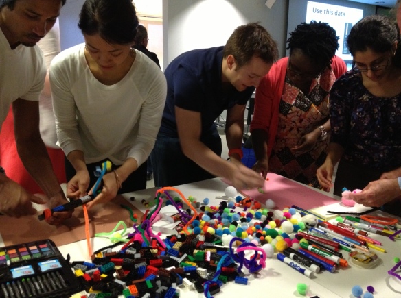
One classic technique to exploring a new domain is to re-use more familiar materials in novel ways. For instance, in my Data Therapy workshops I show up with a bin of craft materials and give people 5 minutes to create a physical “data sculpture” that depicts a tiny set of data I share (click to see some examples).
This activity is fun, engaging, and raises many presentation issues! Inevitably some people choose to focus on one piece of data, while others try to show it in context. People bring their own biases to it. All of that makes for great fodder for the discussion I do right after each person shares what they made.
Reverse-Engineer Other People’s Work
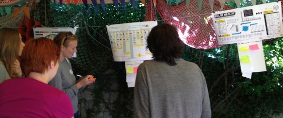
Of course, taking stuff apart is just as much fun as building it! Another activity that both I and my friends at the Tactical Tech Collective us is something they call the “gallery”. You hang up a bunch of examples of visualizations and have people move through them in groups (make sure to include examples for praise and examples for critique!). Each group gets assigned one of these questions to answer for each piece in the gallery:
- who is the intended audience?
- what is the information being shared?
- how would this make the audience feel?
- what visual techniques does it use?
- are their any ethical or reliability issues with the presentation?
Each group writes their answers on a small sticky note that they stick under the piece, so they have the be concise. Then you let everyone wander for a bit, looking at the other groups’ responses. The discussion afterwards is a fantastic opportunity to understand the questions one has to consider when creating visual presentations of information, and creates a shared language within the group for talking about their own work.
Remix Other People’s Work
A great follow up to this activity is to pick one item and have people remix it (we did this at the the TTC Info-Activism Camp). What do I mean by “remix”? The idea is to take the topic and data it presents, and have a brainstorming session about how to craft an appropriate message for a specific audience:
- an online community
- people who disagree with the point
- people who agree but you want to motivate to action
- policy makers
- people within the system being depicted
We broke participants into small groups and assigned each an audience to remix for. People sketched out ideas quickly on paper and then shared them back with the group. This let participants exercise the reflective muscle we developed in the gallery activity.
Think about Impact
You can do more than just LEGO bricks and pipe cleaners. If you want to focus on evidence and persuasion, the Tactical Tech Collective has a great exercise I co-faciliated recently. They first introduce an issue and some related information (for instance, the idea of conserving water and data about water use in home, industry, food production, etc.) Then a handful of participants are brought up to represent various audiences that are involved in the issue and you might want to influence (politicians, companies, food producers, citizens). These audiences are lined up according to how much they care about the issue. Then the fun part – everyone proposes, off the top of their heads, arguments that try to move folks. So people make arguments to the audience representatives, and if the arguments is persuasive the person physically moves down the line to being “more convinced”. I found that this kind of constructive brainstorming activity brought some of the abstract ideas about “influence” into the real world, making them actionable for people when they get back to their day jobs.
Why Making?
The common thread connecting these activities is engaging people together around the process of visually presenting information. I’ve done all these activities a few times now, and have enjoyed the results after each one. People’s insights into visual presentations they see are directly connected to their experiences of producing their own. I worry about statements that simple presentations of information are the “right” answer… I don’t disagree that they can be effective, but we can expect more of our audiences. I believe giving people creative opportunities to build their own visualizations for their own cause is the way to do better.
Jer Thorp, a visualization expert I respect, recently wrote that to make all this data more human
people need to understand and experience data ownership
I completely agree. This will address the potentially disempowering nature of data for those that don’t “speak data”. I hope these types of activities help bridge the gap between the “new explainers” and the so-called “data illiterate”.
Cross-posted to my Data Therapy blog.


