Last fall the Center for Civic Media launched a new partnership with the Boston Globe, the preeminent newspaper in the Boston and New England region. Part of this partnership means that we get access to the last year or so of their archives via their alpha API. And one of the first things we noticed about the API data is that Boston Globe reporters have to enter a location for their news story.
At the Center, we think that media attention matters – in both quantity and quality. This geodata provided a perfect entry to studying how media attention from the Boston Globe plays out spatially across Boston neighborhoods and Massachusetts towns. And with access to the text of the articles associated with different places, we could start to answer some questions about not just the amount of media attention a place receives but how that attention is framed.
Some of our research questions are:
- Is media attention evenly distributed across the neighborhoods and regions of Greater Boston?
- If not, what are the factors that affect the quantity of media attention (# of news articles) that certain places receive?
- Do demographic factors like population, race, income, unemployment or poverty play a role in the amount of media attention a place receives?
- Can we start to assess the quality of media attention that a certain place receives?
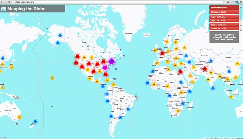
I’ve spent the past several months building an interactive tool called Mapping the Globe to browse Globe archives spatially, running statistical regressions, and making some GIS maps to begin to answer some of these questions. You can see the live prototype of Mapping the Globe at www.kanarinka.com/mappingtheglobe. The tool is currently working off of a database of 23,000+ geocoded articles from a period between November 2011 to present. Each night the tool downloads new articles from Globe and includes them in the analysis.
Here’s what we’ve discovered thus far.
The Boston Globe is regionally focused
Ok big whoop. We knew this already given that the Globe bills itself as “a leading news source for Massachusetts”. But it’s interesting to see this quantified on a map. More than two-thirds of the articles in our corpus are geocoded to the New England region. There is a good amount of attention given to the rest of the US, particularly in major cities like New York, Washington and Chicago, and then the attention fans out across the globe. Internationally, news coverage is focused on major international cities like Paris and London and regions where the US is involved in military campaigns. There is relatively very little coverage of Africa, Central Asia (apart from Afghanistan) and South America.
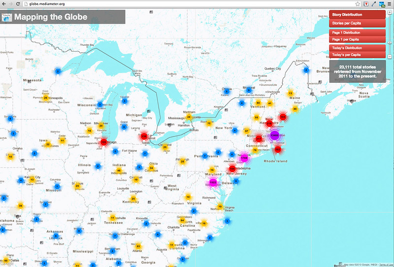
The Globe’s media coverage is not evenly distributed
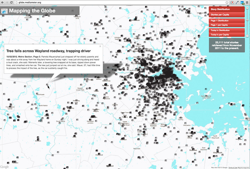
If you zoom in on the “Story Distribution” view in Mapping the Globe you can see the placement of individual news stories across Greater Boston. Mouseover a story icon and you see the story headline and a short summary of the news article at that place. In this view it is immediately apparent that the Globe’s media coverage is not evenly distributed across space. It follows what might be described as a gravity model with the city of Boston at the center where the news articles are highly clustered.
The Globe’s media coverage is not evenly distributed even when accounting for population
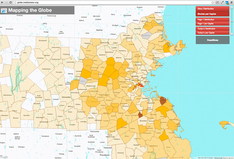
Of course the population of Boston also varies as you spread out from the city center so perhaps articles simply correlate with population differences. Mapping the Globe has a “Stories per Capita” view. If we hypothesize that population is the main factor in media attention we would expect the map in this view to be mostly one color with the same ratio of stories per capita for each Boston neighborhood and MA town, however it’s clear from this view that there is significant variation, particularly in Boston and Greater Boston. The neighborhoods at the center of town – Downtown (State House), South Boston Waterfront (Court House & Convention Center) and Leather District (Financial) – receive an amount of attention disproportionate to their population as might be expected given that so much news happens in those places. Less explicable is the fact that certain dense Boston neighborhoods like Hyde Park, Roslindale, Brighton and Mattapan receive far less attention than do suburbs on the I-95 beltway like Lincoln, Concord and Sudbury.
Here’s a stories per capita map created in GIS that isolates just the Greater Boston area for analysis.
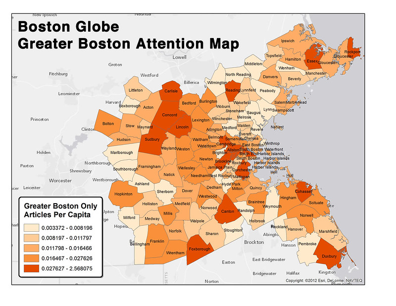
Certain places with high per capita ratios make intuitive sense. Foxborough, for example, is where the Gillette Stadium is located so most Patriots football news happens there. But what explains the high per capita ratio of the northwestern suburbs like Lincoln, Concord, Sudbury and Carlisle? Why doesn’t Medford get more attention? What’s so special about Cohasset and Duxbury?
When running statistical regressions on article counts by place, population did show up as a significant variable but it still only explained about 30% in the variation of media attention across Massachusetts. What else could account for this?
Demographic factors like race, income, poverty and unemployment don’t seem to explain the variation in media attention by place much better than population does
You might look at the above map and make the guess that income is a factor in media attention — perhaps the Globe pays more attention to wealthier, whiter areas like Lincoln over poorer areas with more minorities like Medford and Hyde Park. I thought so at first, too, and collected data on unemployment, poverty, median household income and % non-white residents for every Boston neighborhood and Massachusetts town. Plugging them into a statistical model and running a multiple regression, these factors don’t seem to explain a significant amount of variation, even when separating Greater Boston from the rest of the state of Massachusetts.
Here are some untested guesses about what explains media attention variation by place
If none of these demographic factors – race, income, poverty, unemployment – explain the variation in number of stories by place, what factors might account for that? Here are a couple of unfounded guesses that remain to be analyzed:
- Locations of reported crimes
- Where Globe reporters live
- Where Globe readers live
Not explaining the variation is a good thing!
Even if some of the above guesses turn out to have some bearing on media attention there will still be a significant amount of variation or “newsworthiness” that can’t be explained by statistical factors. As Ethan Zuckerman says, “news distribution is a combination of novel events and systemic biases”. We may be more likely to look for crime in Mattapan and football in Foxborough, but it doesn’t make those crimes and that football less newsworthy to write about. And conversely, it doesn’t preclude us from writing about crime in Lincoln and sports in Needham when the opportunities present themselves.
More important, perhaps, than being able to statistically explain why certain places receive certain levels of media attention is teasing out the quality and framing of that media attention. When does repeated newsworthiness in a particular place become a systemic bias? And how does the media’s representation of place affect the perception of that place both by outsiders and by its own residents? Here we have to turn to more qualitative methods to examine how to get at an aggregated sense of place for Boston neighborhoods and Massachusetts towns as conveyed by media coverage in the Boston Globe.
Qualitative Methods
So far we have focused on the quantitative side of this story. But what about the quality of media attention? A place may get a proportionately high amount of stories but they might be filled with stories about crime and decay. And conversely a place might receive little media mention but what it does get might paint a picture of a rich, vibrant community. It almost goes without saying but the stories told about places affect our perceptions of them.
In Mapping the Globe, there are two ways we get at the qualitative, contextual side of the data associated with Boston neighborhoods and Massachusetts towns that can start to point to patterns in overall media representation. When looking at the Stories per Capita view, clicking on a town or neighborhood triggers two things:
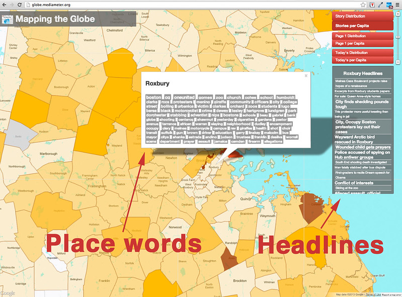
- All headlines associated with that town – These show up in a scrolling menu on the right-hand side of the screen. The larger size of the font corresponds to whether or not the story was on the frontpage of any section of the paper. You can click on the headline and it leads you to the full story on the Boston Globe’s website.
- “Place words” associated with that town – Approximately 100 words show up in a popup box. These are words that show up more frequently in Globe articles related to this town or neighborhood than in other articles in the document set. Here we are using the python nltk library to do term frequency-inverse document frequency natural language processing on every article in the corpus. The size of the font corresponds to the frequency, relative uniqueness and statistical significance of that word to that place, i.e. bigger words either occur more frequently and/or are more unique to that place.
Legibility and Local Knowledge
Using these two measures – headlines and place words – a picture of each place as it is represented through the Boston Globe starts to emerge. However, for shorthand like headlines and word clouds to be legible it helps to have some local, contextual knowledge of a place. For example, I showed the word cloud for Somerville to a colleague of mine who is a resident and he burst out laughing at the word “broga” which was near the top of the Somerville place words. Not being from Somerville, I had assumed “broga” was a proper name of a councilperson or local legislator. It turns out Broga is a yoga program for men based in Somerville which has been advertising all over the city. This anecdote is not meant to disparage yoga for men (which is a very cool thing) just rather to say that decoding headlines and place words may need an infusion of local knowledge and research to be legible.
Let’s take the above-mentioned town of Foxborough for example.
Foxborough
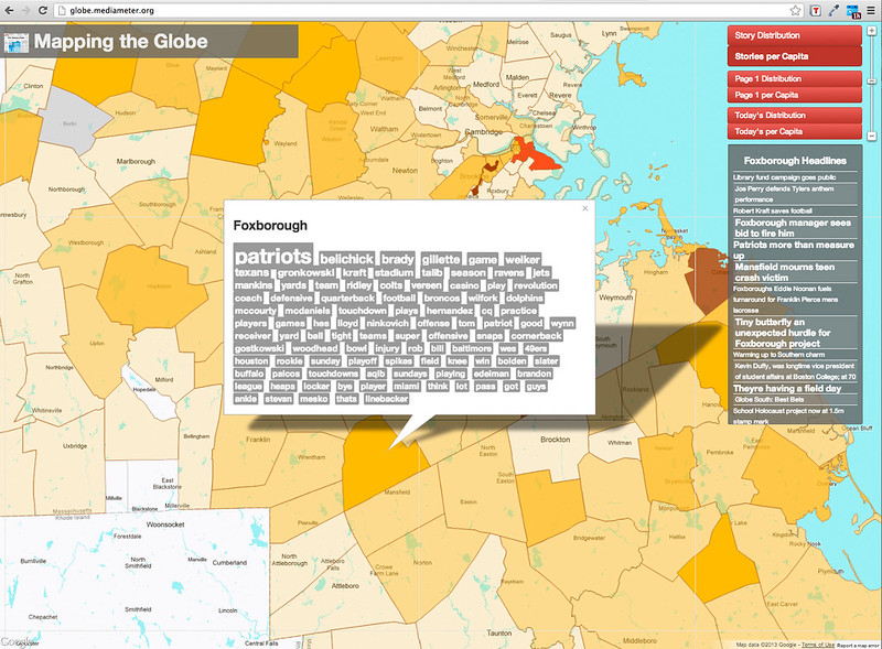
What kind of picture emerges from looking at the words and headlines associated with Foxborough? The first place word that occurs with the most frequency in relation to Foxborough is “PATRIOTS” and the word list continues to enumerate words that are almost all associated in one way or another with football – the players (“brady”), the field (“gillette”), and game words (“season”, “defensive”, “quarterback”). From scrolling the headlines associated with Foxborough we can see that the majority of more important articles indeed have to do with football or the patriots in some way (“Patriots more than measure up”, “Bid to stem Gillette tailgating backfires”). However we can also learn from the words (“casino”) and headlines (“Casino foes prevail in Foxborough vote”) that there was a significant debate about a casino in Foxborough. And while the place words relate mostly to football, the headlines reveal that there is some coverage of community initiatives like library funding and home sales.
North Adams
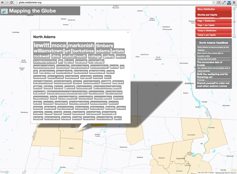
So let’s take this to another town in Massachusetts that is well-known: North Adams, former mill town and now the home of MassMOCA, a spawling art complex with exhibition halls the size of football fields. One immediate observation is that quantitatively speaking, North Adams has much less coverage than Foxborough. Just eight headlines show up on the right-hand side of the screen. But like Foxborough the majority of these articles relate to one thing that the town is known for which is, in this case, art. The first three words “lewitt”, “moca” and “markonish” are related specifically to MassMOCA. Many, though not all, of the rest of the place words are related to general art words (“collage”, “gallery”, “aesthetes”) or specific art places in the area (“rockwell” for the Norman Rockwell Museum, for example). And once again the headlines both support this general arts focus but also show that there are a couple of non-art related articles (“North Adams to improve access for the disabled”).
Mattapan

But one of the main reasons for comparing both MA towns and Boston neighborhoods was so that we could look at varying qualitative patterns in coverage between neighborhoods in Boston. One of the starkest examples of this is the neighborhood of Mattapan where both place words and headlines point to a majority of articles related to crime and punishment (“juror”, “killings”, “verdict”, “trial”, “shootings”, “murder”). Indeed the three most frequent and unique place words associated with Mattapan are “kimani”, “moore” and “mcevoy” who are respectively a key witness, the defendant and the judge in a high-profile trial of the crime known as the “Mattapan Massacre” which resulted in the deaths of four people, including a toddler, in 2010.
But before we jump to label this as a systematic pattern of media coverage (“the Globe only covers crime in Mattapan”), it’s important to take note of how a single story that has played out over this time period. As of this writing, twelve of the 41 articles about Mattapan relate to the Mattapan Massacre story – that’s almost 30% of all articles about the place related to one story. There are five articles about other crime stories (i.e. “Woman critically injured in stabbing”). Combined that makes 41% of Mattapan articles crime stories whereas our previous couple towns we have looked at had none.
What does this mean? Can we say that crime and punishment is over-represented in the media about Mattapan? How much do Globe readers want to avoid Mattapan? How much did this single high-profile story skew the Globe’s representation of this place during the time period we are looking at?
But part of the story is missing
As a follow-up to this initial post I had a conversation with David Dahl, Regional Editor of the Boston Globe. He pointed out that Mapping the Globe currently doesn’t contain articles from the Your Town section of the Globe’s free website boston.com and possibly also does not contain content from the bi-weekly regional print publications Globe North, Globe West and Globe South. These represent two editorial strategies – one for online readers, one for print readers – to provide comprehensive coverage of the towns and neighborhoods in Greater Boston. This data feels crucial to include in our analysis and may very well change both the quantitative and qualitative results that we are seeing for each place – so there’s our first next step to take in this research.
Summary
We are still at the beginning of our experimentation with evaluating media attention across the local geography of Boston and Massachusetts. Our goal is to experiment with methods and technologies enough to be able to come to some reasonable conclusions about media attention locally and then use these methods to do spatial analysis at a global level with multiple news sources from the MediaCloud project. How are different countries and places represented differently in, say, the New York Times versus the BBC? How can we use a variety of both quantitative and qualitative methods to draw conclusions about patterns of media attention in relation to place? How do we tease out the differences between general newsworthiness and systemic bias? And then how do we work to change those biases?
Ideas, questions and critiques very welcomed below in the comments section or email me directly: dignazio@mit.edu.