The Extreme Data and Storytelling plenary session showcases people who are out on the frontiers of storytelling, and who are analyzing and presenting data to make sense of large-scale, complex human issues. They include a scientist using data to unpack the mysteries of economic development, a cartographer working to make poetic, public visualizations of place and a storyteller who’s going to amazing lengths to tell the story of human migration. How do you map the world in ways that people can make sense of? Data visualization for legibility is one thing but visualization is also a form of poetry. How do you create images that stay with us for a long time?
Truly crazy data: Cesar Hidalgo, MIT Media Lab
Cesar Hildalgo is an assistant professor at the MIT Media Lab. At the lab, he leads the group Macro Connections whose work focuses on applying concepts of complexity, evolution, and network science to help countries raise the living standards of their citizens. Cesar is finding ways to open data and tell remarkable stories.
Cesar starts his talk with a story about a visit from the UN Human Development Index of 2010. They wanted something bold for their 20th anniversary edition. After a brainstorming meeting, Hidalgo presented the idea of using mobile phones in developing countries which was building on research published in Nature about mobility patterns in developing countries.
The UN team described how the HDI is actually a rather rough index of the human condition. They were interested in how they might depart from charts and numbers to reimagine big data. Cesar built a 74-page report with different visualizations, different rankings and distributions, networks, and referencing in groups. The core problem of HDI is that you are adding everything up, but Hidalgo’s team developed a “Development Tree” visualization which was not as much about aggregation. Prior to the team’s work, the HDI had really been focused on the line graph.

In 2010, the HDI calculation changed their algorithm for development very significantly. And unfortunately not all of the propositions from Cesar’s team were adopted, so the team decided to publish their own book, the Atlas of Economic Complexity, predicated on the argument that:
“Industrial structures are a strong leading indicator of future growth. The evolution of industrial structures is predictable.”
Countries are complex, like phenotypes and genotypes. Which variables are the most important to track? Cesar notes that “the mix of things that matter in a country are expressed in their industrial structure.”
Cesar’s team’s report became highly popular. The accompanying book has over 1,000 visualizations. The breadth of industrial data about countries is large, counting over 50 years of data. The site has over 24 million interactive visualizations which can be used as examples of storytelling.
For example, in the past, coffee represented 54% of Brazil’s exports. Another chart shows that Brazil represented 35% of overall coffee market. In 2009 that ratio had radically decreased but Brazil is still a leading exporter of coffee. Cesar’s point is that although the Washington Consensus said “it doesn’t matter if you diversify exports, as long as you export something,” (it looks the same in the aggregate), this report enables people to quickly visualize and understand the importance of diversifying your economy.

In the project Participie Cesar’s team is trying to design new forms of online political participation. For example, the federal budget is a pie chart but in this case you can actually change budget lines and see how your changes affect the overall budget. Participants get an itemized receipt detailing the overall combined with their own contributions. The site is connected to social media and commenting systems to enable debate about budgetary changes and compare your participation to that of others.
For Cesar, resolution is one of the core ideas of working with large data sets. What might this mean? Take the example of Galileo—he looked at an object everyone had seen already with their own eyes: Jupiter. It is a bright celestial object. But Galileo saw it with a telescope; he saw it in higher resolution. This enabled him to tell a different story (rather than just a refined or more specific one). It changed our way of looking at the universe forever. Now one could see that there were objects orbiting the planet. Which meant that the earth was not the center of the universe. Resolution is not cosmetic—it is something that will ultimately change our stories.
Nathaniel Vaughn Kelso, Stamen Design
Nathaniel Vaughn Kelso works at Stamen Design, a design & technology studio out of San Francisco (who, as an aside, recently published the most beautiful set of mapping tiles based on Open Street Map data). Kelso worked for eight years at the Washington Post. He is a professional cartographer
who came to journalism through National Geographic.
Stamen is located in the Mission in San Francisco. They build data visualization tools and stories, of which many are map-based. The goal is very different than the Post as it is client-driven and works to tell the stories of those clients. At about 12-15 employees, the firm’s big splash project was Oakland Crimespotting—put together by Mike McGursky, one of the partners at Stamen. He had seen a lot of police reports about crime statistics and realized that it was extremely hard to understand the pattern of crime without seeing it geographically located.

Stamen tries to be very public about its projects in a way that encourages feedback and engages the public in a participatory process. Their goal was to make something that was legible by the general public.
Stamen received a Knight grant two years ago to explore civic data, the presentation of that data, and how one might go about making it more exciting and usable for the general public. The grant was for Dotspotting—a project that enables members of the public to upload small data sets to be viewed in geographic context. For example, a data set about locations of “See Something, Say Something” posters. In Dotspotting, every item has a geo-referenced point on the maps as well as a separate, individual view that enables it to be written about and referenced independently from the map. Following this project, they received numerous inquiries about using their base maps—people wanted to see the maps “without the dots.”
Early on, Stamen had designed custom layers on top of Open Street Maps for a client (Cloudmade).
“How can we have supporting mapping frameworks that allow stories to be told?”
In addressing this question, Stamen recently launched three new and visually arresting map styles available to the general public: Toner (which was used in the Dotspotting project), Terrain (which is similar to Google Terrain View and dives into symbology), and Watercolor (which has gotten a lot of buzz).
Stamen wanted to turn maps on their heads and release them from the servitude of GPS devices. But taking OpenStreetMap data and making your own maps is quite technically challenging. So they wanted to make something that people could embed into their own map-based projects online that might help to evoke a sense of place. In the Watercolor style for example, there are no labels and no text that overlays the map but the visuals work to convey a poetic sense of place that more functionalist maps do not have.

Nathan encourages news organizations to stop blocking Pinterest as it is an amazing way to start people talking about the visuals that we are making. In a strange turn, people have turned Stamen maps into cupcakes and eaten them at conferences (seriously—check out the link).
Stamen has also posted their map data to GitHub. How do we make a multi-page technical recipe easier for people to use? What does the map look like when it changes from edition to edition?
“We initially made a map of rising seas for NYC but it turns out to be very hard to grok and make meaningful for a general audience.”
Stamen’s most recent project is Surging Seas which is built with a great deal of data. Climate change is hard to make personal because it is so data-driven. At Stamen, they first made “Climate Central” a tool to help scientists make their data useful at the street level (not just a city, county). The questions they are asking include: How might you take this big data and customize it just for the individual viewing the map? How do you make big data personal?
Truly crazy story: Paul Salopek, the seven-year walk
Paul Salopek is a two-time Pulitzer prize winning journalist who has covered international affairs, war, and the environment for the Chicago Tribune and National Geographic, among other publications.
Paul introduces himself by noting that he is losing his voice due to his extreme storytelling but how falling silent might be more fitting for this project which is about narrative silences online (in contrast to a medium that values hyperactivity).
Salopek describes how the previous night he looked up the definition of algorithm on webopedia:
algorithm (n): A formula or set of steps for solving a particular problem. To be an algorithm, a set of rules must be unambiguous and have a clear stopping point.
Upon considering the conference’s juxtaposition of “story” and “algorithm” Paul says he realized there are both similarities and differences between algorithms and stories. They share the first sentence—”a set of steps for solving a particular problem.” In contrast to algorithms, however, stories do not have a lack of ambiguity or a clear stopping point, especially when it comes to human beings.
Paul begins describing the monumental, seven-year narrative project upon which he is about to embark. About 50,000 years ago the first humans walked out of Africa. Starting next year, carrying an ultralight laptop and a satellite phone, Paul plans to walk out of Africa starting from the cradle of our species, following the pathways of the first humans as defined by the fossil record and the science of genography.
He will leave the Rift Valley to the Red Sea, through Kurdistan, march eastward over the gravel plains of South Asia, industrial coast of China, walk up the commercial corridor, cross the Amer River into Russian Siberia, across the North Pacific over the Bering Strait, and ramble down the western coast of Americas, to the last continental fringe we occupied – Patagonia. This project is called Out of Eden, a culmination of a life spent across many of these countries documenting and reporting on human migration. Paul has told numerous stories about displacement and conflict and war from places around the world. There are stories of violence and good stories as well, for example children in East Africa going to school. As he collected his stories, he realized they conform to genography. That “we are all slowly on this collective walk into the future.”
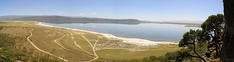
This isn’t Paul’s first walk. Last August, Paul walked with the Daasanach nomads in northern Kenya to understand chronic hunger in the Turkana basin.
The title of this panel implies that this is a “truly crazy story.” But the counter argument is that jetting around the world and parachuting into stories is much more unnatural. As is blogging or tweeting about news events. This hyperactive disconnectedness is also extreme and unnatural. Walking into stories, slowly, might be much more normal, particularly if you think of bards or griots. Out of Eden is ambulatory journalism and a way to slow down information gathering.

Paul asks the audience a question: “How far does the average American walk in a year?” The audience offers up responses: 300 miles? 20 miles? Paul details that the studies vary significantly—it depends on where you are, how active a lifestyle you live, etc., but the answer is somewhere between 90 and 1,000 miles.
And what about the hunter gatherers who walked out of Africa? Researchers have actually tracked this and made educated guesses that average to around 3,200 miles per year. Ancient humans would walk across the entire continental US every year of their life. This is the way people moved across the surface of the earth for 90% of our history. It’s about nine miles a day for a man, six for a woman.
Paul’s project is a walk across 2,500 generations of human history. It will span about 15% of his own life. He won’t be taking breaks. He will be making recordings, audio and texts. He is walking at three miles per hour into stories and “inviting a global audience to tag along on a slow planetary stroll.”
“Our brains changed as we moved across the world. We innovated our way across obstacles.”
Paul will be writing about narratives with which he is already familiar. For example: the challenges of climate change and the efforts to cope with it; the vagaries of foreign aid (a recurring theme); stories about cultural rescue; the huge translation gap of books into Arabic. He’ll be walking through stories about language extinction, fourth generation warfare, 2010 as a milestone for the majority of humanity living in cities.
Paul admits that it will be daunting and emphasizes that it isn’t about athletic stunts or physical feats but rather a journey of the mind. He will be accompanied by others at various points: students, workers, nomads.
But why move around the world on foot for seven years? Paul promises there are no shoe sponsors and offers up a reasoning based on speed:
- The amount of information being generated by bloggers, journalists is almost self-defeating.
- To slow people down—to offer them more meaningful pace of storytelling. We are overwhelmed with data. Perhaps a throughline that spans years, not just hours and days might serve as an antidote.
Paul sees his dispatches as episodic rather than daily. He won’t be microblogging, won’t be describing the sand in his food, how many blisters or hangnails he has. There will be blackouts between stories that might last long periods for his own security.
Paul calls this “Slow journalism”—akin to the slow food movement. People are drawn to the slow food because it has texture and taste, but also because it has a human connection which you cannot get through industrial foods. What might “heirloom reporting” look like? What kind of stories might still matter in years to come? He wants his stories to still carry meaning twenty years on.
The planet might seem flat to globe-trotting pundits who look down from their hotel suites above but Paul says that it is absolutely not flat. And the stories are hidden in the topography. He hopes to find connections between global stories—landscape and conflict, climate and economy. This, he says, is a journey in the spirit of Herodotus.
The second part of the definition of the algorithm will never fit the Out of Eden project because our human trajectory will never be anything but ambiguous. Paul is hopeful—we didn’t stop our roaming when we reached Patagonia 12,000 years ago.
He closes with a passage from Pattiann Rogers’ poem, Generations. “They have been walking from the beginning…”