![]()
I was lucky enough to attend Eyeo Festival this year thanks to the Ford Foundation. There were many thought provoking and inspiring talks as well as conversations over Minneapolitan cuisine. One of the recurring themes I picked up on was how to respect data when doing data visualization, illustration, or art. This came up in different ways and under different names among speakers whom I saw talk. Furthermore there was tension and contradiction across the talks about the type of and level of respect due to data.
Data Isn’t Neutral
The festival’s first day of talks started with a first-rate presentation entitled “Multiple Dimensions” by Laura Kurgan and Jen Lowe from Spatial Information Design Lab at Columbia. They argued a not unfamiliar concept to us at the Center for Civic Media: data is neither neutral nor static. In fact, data comprises multiple, relevant dimensions. They used the metaphor of Processing‘s particles, which are defined by position, velocity, and acceleration, as well as having interactions with other particles. You need to ask: What are the kinds of particles of data you are working with? What are the particle systems you are working with? And what kind of particle are you?
Kurgan and Lowe described the cycle of SIDL’s work as: Data -> Design -> Policy -> Built Environment -> People -> Data. You can start anywhere along this cycle and follow it around, but you should remember that these areas affect each other. They offered some examples of new projects that illustrated their points. Port to Port, sponsored by Thomson Reuters, is an attempt to map global shipping routes for oil. The end goal for Thomson Reuters is predictive analytics for ship trajectories relevant to futures markets. The problem is defined by shipping’s unregulated nature: 30% of ships’ logs are estimated to be wrong and many ships turn off their GPS beacons when they get into international waters. Unlike strictly regulated air traffic, it’s not possible to construct the same flight patterns from existing data.
Furthermore, the SIDL team is interested in telling stories at different scales, i.e. not just the global picture of shipping paths between ports but also the story of an individual ship, where it goes and perhaps why. This means combining Big Data with Ethnography. They point to recent work by Heather Ford and Kate Crawford as inspiration.
Data Doesn’t Explain Itself
Ben Fry, co-creator of Processing (a Media Lab alum!) and founder of the Boston-based data visualization consultancy Fathom, talked about his shop’s process for working through a data visualization project and presented their latest work Connected China, a tool for exploring the connections between China’s powerful elite (also for Thomson Reuters).
Fry argued that working with data requires that design, development, writing, and narrative all be done in house. He suggests that Fathom’s projects like Connected China are unlike most data visualization projects, which are based on easy to get and easy to visualize (e.g. clean) data. The team started by familiarizing themselves with the domain, reading Richard MacGregor’s book The Party: The Secret World of China’s Communist Rulers. They worked with Reuters journalists and domain experts to map out the connections between the rulers in terms of multiple dimensions that are in many cases opaque to Western or outside audiences.
The raw data for the social network view was incomprehensible at the start. They created many intermediate visualizations and iterated over thresholds for the degrees of connection necessary to achieve the appropriate clarity and weightings for the patterns in the network. They had the basic data structure done in the first six weeks but it took many months to complete the final project, writing the entire HTML5 and JavaScript app from scratch.
Drawing Before Data
The Festival’s second day of talks brought Giorgia Lupi to the stage to present her gorgeous work with Accurat. Her talk “Data I Paint With” discussed the stories, composition, and inspiration that goes into her attempts to make “beautiful compositions with data.” She made sure to point out that one of Accurat’s partners was a sociologist, who was in charge of wrangling the data and connected statistics.
Her own process is summed up as “before I think, I draw.” For her, drawing is the practice of externalization, finding representations to understand and to abstract. This translates to the spreads they create for Corriere della Sera‘s weekly cultural magazine: visualizations of data designed to offer interactivity on the page in terms of multiple layers of appreciation and exploration. She offers the example of visualizing Nobel Prize winners in terms of musical notation (see below). In this case, her background in music study compelled her to visualize data using this metaphor and style. And rather than having it extend from the data first, she looked for data that would match her vision for renderizing a visualization this way, and found the Nobel winners! She implored us “don’t tell Tufte.”

In another case, her shop visualized the lives of ten abstract painters. Data collection involved going out to Wikipedia and picking out pieces of data about ten painters they liked rather than using a kind of “scientific process.” Another “don’t tell Tufte” moment. Lupi’s work is beautiful, but data is clearly used as inspiration for her compositions/stories. Respecting the data is a secondary goal, and I was left curious about how her sociologist partner feels about their work, and describes it to others.
Dubious Dataviz
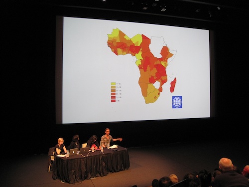
The last day of the Festival included a panel entitled “Lightness & Weight, Data & Social Justice.” The first speaker on the panel was Jake Porway, founder of DataKind. He cautioned the audience to think carefully about civic data and data visualization when attempting to use it for social justice. He offered two cases. The first was World Bank data about poverty in sub-Saharan Africa (see below). He asked us “What’s wrong?” We finally realized the resolution was too low. All of South Africa is not one grade of poverty.

Porway went on to discuss NYC’s Stop and Frisk Report data. WNYC’s visualization of the data suggests that the Stop and Frisk program is not effective at coming up with guns since they aren’t collocated with the highest rates of stops. Then Porway showed visualizations corrected for per capita, and rendered as a heat map, which told the opposite story: the program was working. Then he asked us, “Where does this data come from?” The answer is self-reporting police officers. There was no way these are all perfect, hand-written reports, and maybe, just maybe, some police wouldn’t want to report unsuccessful stops with the same enthusiasm as successful ones. The kicker was showing us the “race” column, in which police report whether the target was “White,” “Black,” or “Hispanic!” (I’ll talk more about this panel and the theme of social justice through data in a separate post.)
Data Objectivity Versus Subjectivity
After the panel, Stefanie Posavec gave a talk entitled “Subtle Data,” which attempted to carve out a categorical space for subjective interpretations of data. Upfront, Posavec addressed a pet peeve of hers: the “Data Fundamentalist” who always offers the same critique at talks like hers by taking issue with the fact that a decision was made for aesthetic rather than objective, data-driven reasons. She felt this was unfair and argued there is a gradient between the black and white of objective and subjective, and it was in this “hazy, in-between space” that she liked to work, an area she called “data illustration.”
For Posavec, data illustration is separate from data visualization or information design. She wants a more emotional experience through the data, and thinks designers like her need more space to move in how they want to. The question then becomes how to balance the objective with the subjective. She observes the objective by “respecting the data,” which to her means 1) being truthful and accurate with it, 2) always trying to show subtle insight or the ‘gist’: she explicitly doesn’t expect academic research and rigor to be gained from the work she does, but she does want the audience to get something from it, and 3) providing an explanation: she uses legends so that people can look further into the data behind an image if they want to.
To observe the subjective, Posavec adds “poetry & emotion,” by 1) using meaningful data: data that has a beautiful intrinsic connection to the message she’s trying to convey, 2) using data as a secondary design material: i.e. data is the foundation for the subjective message being built, and 3) inspiring a meaningful connection with the data. She references Santiago Ortiz‘s idea of data as an “easter egg” in data art.
Goals and Limitations of Working with Data
I agree with Posavec that data can be infused with poetry and emotion, and I think her principles can work in concert with the respect of data. What was missing for me in these later talks though was the kind of critical reflection of data, and what it means to be using data. If you take Kurgan and Lowe’s point that data is neither neutral nor static and Porway’s breakdown of all the ways data can be inherently untruthful or misleading, from its very recording to any of the many ways it can be visualized, you are left with a nearly impossible task of “respecting the data.” This needs to be acknowledged and appreciated.
Perhaps the unspoken and more appropriate form of value in the work of Lupi and Posavec is that the subjective and artistic is an opportunity to offer a bit of subjective truth in place of the sometimes decontextualized “objectivity” of data. Another Eyeo theme was the blurry lines between visualization, illustration, and art, energized by classic debates about the difference between art and design. Another point worth mentioning is that the background of the audience or creator matters too (positionality in Kurgan and Lowe’s terms). I might be best described as a computational social scientist, and so my definition of respecting the data is necessarily stricter. However, I can also appreciate the artistry and importance of creative interpretation that has filled galleries with impressionistic and abstract versions the world that some would argue are closer to truth in our “age of mechanical reproduction.”
This is brings us into the realm of politics. Whenever you use data, you engage with the language of fact and objectivity. As many have observed, fact and objectivity are not necessarily the input or output of working with data. Data is always incomplete. That’s why the best research, at least in the social sciences, combines qualitative and quantitative approaches to answering a question, looking to ethnography and domain expertise, attempting to achieve a more complete picture of the story. Many things aren’t even quantifiable, and often quantification distorts truth rather than laying it bare. In the end, perhaps it’s more apt to discuss respecting the limits of data as well as yourself.
So why bother? Well, my personal interest in respecting the data is born out of thinking about how data visualization can be used as a tool for public awareness, social justice, and social change. In such cases, the data needs to be carefully employed to make a point and make it near unassailable. What I’ve been learning of late is that perhaps less control is more when it comes to trying to make unassailable points. Art helps. But it still requires deep knowledge and strategy. These are all things I’ll be exploring in the next post.