This is a liveblog of a talk given at the Center for Civic Media by Mushon Zer-Aviv (@mushon). Any errors or omissions are the fault of the authors – Rahul Bhargava and Catherine D’Ignazio.
Mushon is a design, educator and activist based in Tel-Aviv. He designed the maps for Waze, but has also worked on more contestational project like Ad-Nauseum. Mushon works at the intersection of design, tactical media and activism.
Mushon began this line of thinking in response to prompts from Tactical Tech Collective and the Responsible Data Forum. The theme is how to think about responsibility through the lens of visualization.
A network is made up of nodes (circles) and edges (lines). These get complicated quickly. At Waze, the street map was the network. Their need was to display how the algorithm thought about the network, vs. how we modeled the network in our head – ie. taking a non-obvious path due to the need to route around traffic. This is especially hard because we want drivers to look at the road, not the app.
In 1990, police shut down 42nd street in NYC for earth day. They tought this would increase traffic, but in fact it reduced it. This was based on a misunderstanding of the flow through the road network. This is called the “Braess Paradox” – where removing an edge can improve the flow of the network.
Paul Baran, a researcher at RAND, published a paper in the 1960’s paper about options for centralized, decentralized, or distributed networks underneath the network. The question was how to design it to survive a nuclear attack. The decentralized network survived this attack best. This led to the TCP/IP network design. This is baked into the core of the internet today.
However today’s flows across the internet are mostly through centralized nodes. We have constructed a myth of decentralized networks that is very popular. This is based on an attractive idea that everything is connected. If we could just count all of them then we could reveal “the big picture”. If we can connect and analyze everything, we can get stuck in a graph of “network fetishism”.
There are various ways to visualize these networks – arc diagrams, force-directed, etc. These layouts help us understand the structure of the network but do not help with understanding the flow or the protocols that govern the network. Nothing in the basic design of the distributed internet can help us understand how it functions today. A more representative diagram has far more connections per node.
A highly distributed network can still include centralized hubs. Optional centralization is a feature of a distributed network.
Nodes tell us what is connected. Edges tell us where the are connected. And flows tell us how they are connected. Protocols tell us why the network functions the way it does. These are the rules that “make sure connections actually work” (Galloway and Thacker).
Networks become the leading model and visual analogy of power and control.
Visualization is an important tool for critiquing our culture. TheyRule.net is an example of this. Hollywood has popularized the idea that understanding the links in a network of people can help you solve a crime. When the network becomes too big for a human to comprehend then a network analysis algorithm can take over. The NSA and other agencies use this same approach to network investigation.
We have an iconic image of a scruffy investigator staring at a corkboard of connections with pins and images. Now the cork board itself is doing the pinning and connecting.
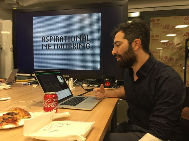
Aspirational networking is this idea, that we can reveal everything with a network.
Networks aren’t bad they are just drawn that way. That’s what makes visualizing them so important. We see nodes and edges but normally we have to imagine flows and protocols. How to we make a network work better? How could we visualize them?
He show’s Gilad Lotan’s social media analysis of the Israeli invasion of Gaza. The story is mostly contained within the node structure – Israelis and Palestinians on social media were not talking to each other.
What happens when the flow is not comparable or quantifiable? He shows an image from Google Buzz, Google’s experiment in social networking.
Directionality is important in text but in network diagrams it is hard to know where to start from. Where is the beginning? He shows an image from theafghanconflict.de. This mapped out the decision tree for what might happen.
We see the world as a narrative. The Panama Papers leak led journalists to try and map the network contained in the documents. Mushon animates drilling into the super complex network, zooming in a huge number for times. Some journalists mapped specific sub-networks around individuals of interest (Sergey Roldugin and Vladimir Putin). The Guardian told a narrative version of this story, an explainer, with video about how to hide a billion dollars. Mushon enjoys how it celebrates narrative with music and humor. These are missing in classic network diagrams.
He shows a revision of the Mossack-Fonseca network where he distinguishes between personal and business connections. If we follow the money, instead of the network, we can tell a narrative walkthrough of all the connections between the nodes, one at a time. Mushon talks through the story behind each node and edge as he adds it to the network. The narration followed the flow, rather than just being a static picture of how things are connected. This made “the network work for us”.
Visualization is for humans; computers don’t need this. To understand the hidden protocols behind this, we need to visualize the algorithms. This practice is currently mostly academic. The visual guide for machine learning is an example of how to educate us about the protocols that govern us, which he characterizes as “humanistic visualization”.
We can and should visualize flows and protocols. We can visual insecure and secure version of TCP/IP’s flows. Mushon shares another example that shows how Tor works.
Even if protocol visualization is limited it sets up an important expectation and possibly frustration. THere is something powerful politically for being frustrated for NOT understanding the protocol.
Getting back to Waze, only some of their ideas were taken to fruition. The effort to build self-driving cars is an attempt to take humans out of the loop completely. Mushon argues against the larger trend that removes human agency from computer-based systems. Our understanding and a computer’s understanding are miles apart.
We need conceptual and visual tools to analyze networks. When we try to visualize this, and can’t, power is lost.
A write up is available here: https://visualisingadvocacy.org/blog/if-everything-network-nothing-network
An audience member asks:
Larry Lessig’s Against Transparency challenged how visualizations like the Panama’s Papers one invite finding narratives that might not be there. There are a wealth of projects like this now. However, knowing that someone is connected to another doesn’t imply there is a story there. If we are going to be doing more of this type of visualization, how do we tell if a narrative is really there?
Mushon replies that conspiracy theories are a huge danger for this type of investigative activism. There are so many possibilities of what one might find, that it is harder to do our job. We see potential there, but the network doesn’t show what is actually happening. It inspires use to complete the picture ourselves. People are excited about network diagrams because they don’t understand them, because they can project things onto them.
We’re overwhelmed by data right now, and need more tools to help us. This is a challenge for design. Even in this talk Mushon just narrated a series of Keynote slides. In visualization we have a distinction between explanatory and exploratory pictures. Exploratory visualizations are more challenging, when we are trying to find a story in the data. We have to go beyond nodes and edges… including flows, allowing comparison, and more. Mushon isn’t offering a solution, but a path towards more best practices and tools for exploring this.
Another audience member notes a talk heard recently by someone trained in analysis, questioning the analysis of networks. That talk walked through a series of decisions along the way that she made which felt arbitrary. It asked, is that ok?
To the room of people here, how are people approaching network diagram analysis.
Ethan notes: Here at Civic Media we use networks to understand what influential sources are within a network of media. Our efforts to visualize flow include things like increasing the strength of a connection based on the number of links. This includes flow and directionality, which are often left out. But even with this, we have errors all the time – because people use links in different ways.
To address this, Civic uses language as an “implicit hyperlink” – where two media sources are connected if they use similar language. This is helpful because you get a visualization of how different sub networks are framing an issue. This is weird because sometimes it just doesn’t work… we’re not sure why. In addition, these maps are readable by experts only. One afternoon some Nigerian election experts came by, so he popped up a live graph about the recent election. This audience clustered around to dig into it. These are exploratory tools, but flawed. If you explain using then it denotes authority, which is worrisome.
Mushon wonders if we are using time. Ethan responds that we do time-slices, but don’t animate. Mushon offers that using the time axis helps you read better.
Mushon has been running workshops on how to lie with dataviz. If you before you explain a network, you show a conspiracy theory within the network, this can serve as a cautionary tale. This prompts the idea that data work is about speech, not truth. This can help allies develop critical skills.
Erhardt shares Civic Media’s analysis of the Trayvon Martin media coverage, which focused on the narrative of how the story changed over time. Validity is tied to the use and argument of our data analysis, not the analysis itself.
Another attendee mentions how the Guardian narrative became meaningful because it was easy to describe the relationships. A lot stories miss the material reality of the node. The people who could provide that context are often missing from the team analyzing the data.
Mushon agrees that these network visualizations are a huge abraction. You are trying to analyze a lot of data, but need to understand and research each of the nodes.
Mushon gave a similar talk at re:publica 2016