This is a liveblog of a talk at the 2016 Data Literacy Conference, hosted by Fing. This was liveblogged by Rahul Bhargava and Catherine D’Ignazio. These are our best attempt to record what the speak was talking about – any accuracy errors are our fault.
Anscombe’s Quartet lets us see how different datasets can have the same algorithmically resolved properties. With our senses, we have some pre-cognitive operations that visualizations can take advantage of.
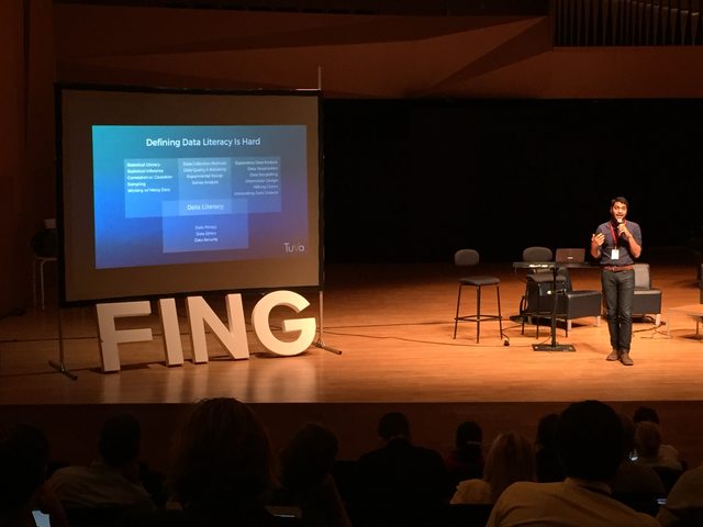
There is a separation between those that can work with the data, and those that cannot. He wasn’t all be able to work with data and act in society using it. How can be welcome all to this? He looking into Constructive Visualization (paper). This study looked at a physical library of objects to build visuals that others could understand otherwise. THey created, updated, annotated a visualization using these basic building blocks. Some were duplications of existing shapes, but others were totally novel. Now there is an open source kit for doing this yourself.
Pauline Gourlet continues with a discussion of more than just the physical for representing data. Sometimes we talk about data we have, but other times we have to go and collect the data we need. What will the choice of the material we use induce in the story? How do we structure the data we are collecting?
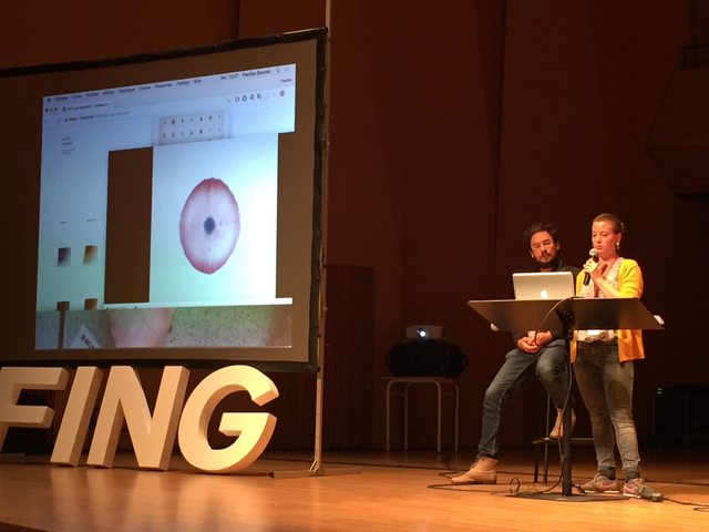
Pauline’s first example looked into looking at emotions and moods. A difficult thing to measure, capture, and report. They started with colors on fabric, because the way it spread on the fabric looked a bit diffused. So you could describe the mixture of emotions. Blue meant sadness, yellow was joy, etc. They animated the charts, and noticed dynamics and patterns in the data they captured.
-
The time of collection changed their moods (like art therapy)
-
The discussion it fueled changed how they talked about their emotions.
-
People wanted to explain the data, and projected themselves into the representations.
They repeated the whole project with primary school kids, to understand how they would experience it. They really wanted to do it. These kids who were 6 understand it, negotiated the meaning, and recontextualized it in the action they had just done. They did it again with graduate students in a design university. The process was a bit more systematized, with a star plot diagram with axis for things like stress. They 3d printed some of the resulting shapes. They also cut out the data as wooden pieces to see the stack of emotions over time. This let you separate and find families of similar days.
A separate example is Pauline’s work looking into the usage of digital fabrication labs (FabLabs). They created a collaborative sculpture, where the placement of objects on a stick would encode what the users were doing. There was also a categorization of why people came to the FabLab (I experimented, I showed, etc). These mini sculptures encoded the timespan, regularity, and purpose of their visits to the FabLab.
Samuel speaks about a workshop they designed, to allow more open types of creation and physicalization. A workshop that is freeform, but lightly constrained. So there was a task that relied on different datasets. They wanted to explore how people would appropriate the physicalization. Pauline speaks to how they explored the physicalization. Sometime easy, involved, and simple to understand. They proposed basic tools and materials, selected materials. Wires, LEGO bricks, tokens, etc. 15 materials. They had 3 types of cards to start the activity – context cards, cards with datasets and cards with tasks (convince, discover, collect). Groups were invited to pick one card of each type, and get three materials. Then they presented to everyone (without describing it). The groups created physical manifestations of the data, liek a string that one would tie to a peg and pull to record the data. Another group created a participatory experience where you received cut outs of people representing asylum seekers, and placed them in your hands to force you to fit them in the EU somewhere.